

藤藤每日一练——Metro Login Form
作者:藤藤 日期:2013-01-18 点击:783

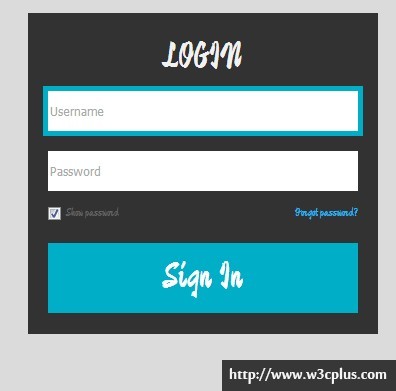
这是一个很简单也很普通的登录表单的效果,只不过这个案例采用的是Metro的UI设计风格,当然不是Metro UI CSS中的东西,设计风格,色彩类似于Metro。另外在加载表单时,给部分元素使用了transition属性,让你在视觉上加载有动画,其在input[type="text"]得到焦点时,使用了box-shadow模仿了border效果。
HTML CODE
对于表单的结构,有各种各样的说法,仅我个来说,我比较喜欢Bootstrap的form表单结构,不过此处,藤藤使用的是自己写的结构,大家一看也明白:
<div class="login-control">
  <form action="" method="get" accept-charset="utf-8" class="form-item">
    <h2>LOGIN</h2>
    <div class="form-item-1">
      <input type="text" name="name" id="name" placeholder="Username">
    </div>
    <div class="form-item-2">
      <input type="password" name="pwd" value="" placeholder="Password">
    </div>
    <div class="form-item-3">
      <input type="checkbox" name="showpwd" value="" id="showpwd" checked="checked"><label for="showpwd">Show password</label>
      <a href="#" class="fr">Forgot password?</a>
    </div>
    <div class="form-item-4">
      <input type="button" value="Sign In">
    </div>
  </form>
</div>
CSS Code
整个案例中的CSS并不复杂,大家想想就知道,一个普通的登录表单能难到哪去,是吧。在这个案例中,使用CSS3的知识也不是很多,第一个是使用了CSS3的属性选择器,第二个是使用了transition动画过渡属性,第三个是使用了盒子阴影box-shadow属性,第四个使用了box-sizing属性修改了box module。具体的我们一起来看看吧。
body {
  background-color: #dbdbdb;
}
.fr {
  float: right;
}
.demo {
  margin: 50px auto;
  width: 350px;
}
.login-control {
  color: #636363;
  padding: 20px;
  line-height: 60px;
  background-color: #323232;
  transition: all 300ms;
  font-family: 'Devonshire', cursive;
}
表单的基本样式,比如说大小,颜色之类的,在这里使用了一个动画属性:
transition: all 300ms;
使用这个属性能让你的表单在页面初次加载时,会有一个从无到有的动画过程,给人看起来不会那么生硬,而且这个属性在后面多次使用到。
/*表单标题样式*/
.login-control h2 {
  color: #f1f1f1;
  font-size: 36px;
  font-weight: normal;
  line-height: 50px;
  text-align: center;
}
/*文本框、密码框样式*/
.login-control input[type="text"],
.login-control input[type="password"] { /*使用了CSS3的属性选择器*/
  width: 100%;
  height: 40px;
  padding: 0 2px;
  border: none;
  box-sizing: border-box;/*改变box module*/
  transition: all 300ms;/*加载时的一个过渡动画效果*/
}
/*input得到焦点的效果*/
input:focus {
  outline: 0 none;/*去掉得到焦点时外边框样式*/
  box-shadow: 0 0 0 5px #00aec7;/*使用box-shadow模仿border效果*/
}
.form-item-3 {
  text-align: left;
  line-height: 20px;
  margin-bottom: 20px;
}
/*复选框样式*/
.login-control input[type='checkbox'] {
  vertical-align: middle;
  margin-right: 5px;
}
/*登录按钮样式*/
.login-control input[type='button'] {
  color: #fff;
  font-size: 36px;
  width: 100%;
  height: 70px;
  border: none;
  background-color: #00aec7;
  cursor: pointer;
  transition: all 300ms;
  font-family: 'Devonshire', cursive;
}
.login-control input[type='button']:hover {
  background-color: #006675;
}
设置表单元素样式时,有两个属性很关键,第一个是通过box-sizing来修改了box module的默认格式,第二就是使用了box-shadow来模仿了border效果,使用input的得到焦点时,有一个不同的效果,但又不影响box的相关参数。
所有CSS代码
body {
  background-color: #dbdbdb;
}
.fr {
  float: right;
}
.demo {
  margin: 50px auto;
  width: 350px;
}
.login-control {
  color: #636363;
  padding: 20px;
  line-height: 60px;
  background-color: #323232;
  transition: all 300ms;
  font-family: 'Devonshire', cursive;
}
/*表单标题样式*/
.login-control h2 {
  color: #f1f1f1;
  font-size: 36px;
  font-weight: normal;
  line-height: 50px;
  text-align: center;
}
/*文本框、密码框样式*/
.login-control input[type="text"],
.login-control input[type="password"] { /*使用了CSS3的属性选择器*/
  width: 100%;
  height: 40px;
  padding: 0 2px;
  border: none;
  box-sizing: border-box;/*改变box module*/
  transition: all 300ms;/*加载时的一个过渡动画效果*/
}
/*input得到焦点的效果*/
input:focus {
  outline: 0 none;/*去掉得到焦点时外边框样式*/
  box-shadow: 0 0 0 5px #00aec7;/*使用box-shadow模仿border效果*/
}
.form-item-3 {
  text-align: left;
  line-height: 20px;
  margin-bottom: 20px;
}
/*复选框样式*/
.login-control input[type='checkbox'] {
  vertical-align: middle;
  margin-right: 5px;
}
/*登录按钮样式*/
.login-control input[type='button'] {
  color: #fff;
  font-size: 36px;
  width: 100%;
  height: 70px;
  border: none;
  background-color: #00aec7;
  cursor: pointer;
  transition: all 300ms;
  font-family: 'Devonshire', cursive;
}
.login-control input[type='button']:hover {
  background-color: #006675;
}
如需转载,烦请注明出处:http://www.w3cplus.com/demo/metro-login-form.html


