

Pure CSS3 Lightbox
作者:大漠 日期:2012-10-20 点击:202

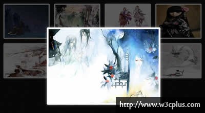
这个Lightbox效果也是一个纯CSS3写的效果,这个效果的制作方法也不算复杂,相对来说比较简单。主要使用了CSS3的“:target”属性来控制对应大图的显示与隐藏,而且配用了transition属性来制作了动画效果,而且还有意思的是使用了table和table-cell来实现图片的居中效果。具体效果请看看详细代码。
HTML CODE
<div class="img-wrap clearfix">
  <a href="#img1" class="lbLink"><img src="1s.jpg" alt="" /></a>
  <a href="#img2" class="lbLink"><img src="2s.jpg" alt="" /></a>
  <a href="#img3" class="lbLink"><img src="3s.jpg" alt="" /></a>
  <a href="#img4" class="lbLink"><img src="4s.jpg" alt="" /></a>
  <a href="#img5" class="lbLink"><img src="5s.jpg" alt="" /></a>
  <a href="#img6" class="lbLink"><img src="6s.jpg" alt="" /></a>
  <a href="#img7" class="lbLink"><img src="7s.jpg" alt="" /></a>
  <a href="#img8" class="lbLink"><img src="8s.jpg" alt="" /></a>
</div>
<div class="lightbox-wrap">
  <div class="lb" id="img1">
    <a href="#close"><img src="1.jpg" alt="" /></a>
  </div>
  <div class="lb" id="img2">
    <a href="#close"><img src="2.jpg" alt="" /></a>
  </div>
  <div class="lb" id="img3">
    <a href="#close"><img src="3.jpg" alt="" /></a>
  </div>
  <div class="lb" id="img4">
    <a href="#close"><img src="4.jpg" alt="" /></a>
  </div>
  <div class="lb" id="img5">
    <a href="#close"><img src="5.jpg" alt="" /></a>
  </div>
  <div class="lb" id="img6">
    <a href="#close"><img src="6.jpg" alt="" /></a>
  </div>
  <div class="lb" id="img7">
    <a href="#close"><img src="7.jpg" alt="" /></a>
  </div>
  <div class="lb" id="img8">
    <a href="#close"><img src="8.jpg" alt="" /></a>
  </div>
</div>
CSS CODE
@-webkit-keyfames fade {
  from {opacity:0;}
  to{opacity:1}
}
@-moz-keyfames fade {
  from {opacity:0;}
  to{opacity:1}
}
@-ms-keyfames fade {
  from {opacity:0;}
  to{opacity:1}
}
@-o-keyfames fade {
  from {opacity:0;}
  to{opacity:1}
}
@keyfames fade {
  from {opacity:0;}
  to{opacity:1;}
}
@-webkit-keyfames grow {
  from{height:0px;}
  to {height:300px;}
}
@-moz-keyfames grow {
  from{height:0px;}
  to {height:300px;}
}
@-ms-keyfames grow {
  from{height:0px;}
  to {height:300px;}
}
@-o-keyfames grow {
  from{height:0px;}
  to {height:300px;}
}
@keyfames grow {
  from{height:0px;}
  to {height:300px;}
}
body {
  background: url(http://www.w3cplus.com/demo/css3/CSS3HoverEffects/black-bg.png) repeat;
}
.img-wrap {
  width: 930px;
  margin: 20px auto;
}
.lbLink {
  display:block;
  border-radius: 5px;
  box-shadow: 0 0 15px rgba(255,255,255,0.3);
  border: 5px solid #fff;
  float: left;
  margin: 10px;
}
.lb {
  width:100%;
  height: 100%;
  position: absolute;
  top: 0;
  left: 0;
  display: none;
  z-index: 999;
  background: rgba(0,0,0,0.65);
  -webkit-animation-duration: 1s;
  -webkit-animation-name: fade;
  -webkit-animation-iteration-count: 1;
  -webkit-animation-direction: normal;
  -moz-animation-duration: 1s;
  -moz-animation-name: fade;
  -moz-animation-iteration-count: 1;
  -moz-animation-direction: normal;
  -o-animation-duration: 1s;
  -o-animation-name: fade;
  -o-animation-iteration-count: 1;
  -o-animation-direction: normal;
  -ms-animation-duration: 1s;
  -ms-animation-name: fade;
  -ms-animation-iteration-count: 1;
  -ms-animation-direction: normal;
  animation-duration: 1s;
  animation-name: fade;
  animation-iteration-count: 1;
  animation-direction: normal;
}
.lb a {
  display: table-cell;
  vertical-align: middle;
  text-align: center;
}
.lb img {
  border: 8px solid #fff;
  border-radius: 5px;
  box-shadow: 0 0 20px rgba(255,255,255,0.5);
  -webkit-animation-duration: 0.5s;
  -webkit-animation-name: grow;
  -webkit-animation-iteration-count: 1;
  -webkit-animation-direction: normal;
  -webkit-animation-timing-function: ease-in;
  -moz-animation-duration: 0.5s;
  -moz-animation-name: grow;
  -moz-animation-iteration-count: 1;
  -moz-animation-direction: normal;
  -moz-animation-timing-function: ease-in;
  -o-animation-duration: 0.5s;
  -o-animation-name: grow;
  -o-animation-iteration-count: 1;
  -o-animation-direction: normal;
  -o-animation-timing-function: ease-in;
  -ms-animation-duration: 0.5s;
  -ms-animation-name: grow;
  -ms-animation-iteration-count: 1;
  -ms-animation-direction: normal;
  -ms-animation-timing-function: ease-in;
  animation-duration: 0.5s;
  animation-name: grow;
  animation-iteration-count: 1;
  animation-direction: normal;
  animation-timing-function: ease-in;
}
.lb:target {
  display: table;
  height: 100%;
}
如需转载,烦请注明出处:http://www.w3cplus.com/demo/pure-css3-lightbox.html


