

Lightbox effect with Tabindex and CSS3
作者:大漠 日期:2012-10-19 点击:248

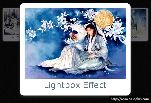
这个Lightbox效果实现原理很简单,就是点击图片或者使用tab键,当图片得到焦点(:focus)时,图片会在当前位置被放大,同时移动Y轴的距离。整个制作过程中使用了HTML5的新标签figure和figcaption,包含图片以及图片标题,同时在figure相邻位置设置一个span标签,通过选择器来控制span标签制作一个overlayout的朦板效果。这个效果中仅用到CSS3属性也非常的简单,利用border-radius制作了图片边框的圆角效果,使用box-shadow制作了图片的阴影效果,最主要的是使用CSS3的选择器配合transition和transform属性制作了一个类似于Lightbox的效果。
HTML CODE:
<section id="slideshow" class="clearfix">
  <figure tabindex="0">
    <img src="http://www.w3cplus.com/demo/css3/CSS3HoverEffects/5.jpg" alt="Lightbox effect with Tabindex and CSS3" />
    <figcaption>W3cplus Demo</figcaption>
  </figure>
  <span></span>
  <figure tabindex="0">
    <img src="http://www.w3cplus.com/demo/css3/CSS3HoverEffects/6.jpg" alt="Lightbox effect with Tabindex and CSS3" />
    <figcaption>Lightbox Effect</figcaption>
  </figure>
  <span></span>
  <figure tabindex="0">
    <img src="http://www.w3cplus.com/demo/css3/CSS3HoverEffects/3.jpg" alt="Lightbox effect with Tabindex and CSS3" />
    <figcaption>A simple idea...</figcaption>
  </figure>
  <span></span>
</section>
CSS CODE:
body {
  background: url(http://www.w3cplus.com/demo/css3/CSS3HoverEffects/black-bg.png) repeat;
}
#slideshow {
  text-align:center;
  width:886px;
  margin: 50px auto;
}
#slideshow figure {
  position: relative;
  float: left;
  margin: 20px 37px;
  z-index: 100;
  width: 200px;
  background: #fff;
  border: 10px solid #fff;
  border-radius: 8px;
  box-shadow: 0 3px 10px #ccc;
  -webkit-transition: all 0.7s ease;
  -moz-transition: all 1s ease;
  -o-transition: all 1s ease;
  -ms-transition: all 1s ease;
  transition: all 1s ease;
}
#slideshow figure img {
  width: 100%;
}
#slideshow figcaption {
  font-family: verdana, arial, sans-serif;
  font-size: 1.1em;
  text-align: center;
  color: #5d7885;
  background: #fff;
}

#slideshow figure:focus {
  outline: none;
  z-index: 200;
  -webkit-transform: scale(2.8) translateY(50px);
  -moz-transform: scale(2.8) translateY(50px);
  -o-transform: scale(2.8) translateY(50px);
  -ms-transform: scale(2.8) translateY(50px);
  transform: scale(2.8) translateY(50px);
  box-shadow: 0 3px 10px #333;
}
#slideshow figure:focus+span {
  position: absolute;
  top: 0;
  left: 0;
  width: 100%;
  height: 100%;
  background: rgba(0,0,0,0.6);
  z-index: 150;
}
如需转载,烦请注明出处:http://www.w3cplus.com/demo/lightbox-effect-with-tabindex-and-css3.html


