css3圆环形旋转
作者:结一 日期:2012-09-15 点击:5763

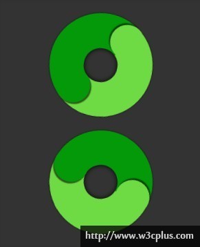
本实例看起来有点像太极,其实更如一块环形的玉佩,设计比较好看。先设计一个圆形填充一个135deg的两个颜色的渐变,各位一半。然后设计三个子元素为上中下的小圆,一个为浅色的与渐变背景的浅色的一样,一个为黑色的充当中间的孔,一个为深色的与渐变背景的深色一样,为了表现更佳,给这三个小圆各自应用了box-shadow生成阴影。然后就是父元素的animate转动360deg。
html主要代码:
<div id="wrapper" class="wrapper">
	<div id="up"></div>
	<div id="mid"></div>
	<div id="down"></div>
</div>
css主要代码:
#wrapper{
width:150px;
height:150px;
background: -moz-linear-gradient(135deg, rgba(111,219,68,1) 0%,rgba(111,219,68,1) 50%,rgba(3,153,8,1) 50%,rgba(3,153,8,1) 100%);
background: -webkit-linear-gradient(135deg, rgba(111,219,68,1) 0%,rgba(111,219,68,1) 50%,rgba(3,153,8,1) 50%,rgba(3,153,8,1) 100%);
background: linear-gradient(135deg, rgba(111,219,68,1) 0%,rgba(111,219,68,1) 50%,rgba(3,153,8,1) 50%,rgba(3,153,8,1) 100%);

margin:20px auto;
border-radius:100px;
box-shadow:0 0 3px rgba(0,0,0,.7);
}
#up{
float:right;
width:50px;
height:50px;
border-radius:100px;
background:#6fdb44;
/*box-shadow*/
box-shadow:-2px -2px 1px rgba(0,0,0,.6);
margin-right:18px;
margin-top:11px;
}
#down{
float:left;
width:50px;
height:50px;
border-radius:100px;
background:#039908;
margin:-14px 15px;
box-shadow:2px 2px 1px rgba(0,0,0,.6);
}
#mid{
float:left;
width:49px;
height:49px;
border-radius:100px;
background:#333;
margin-left:50px;
margin-top:-10px;
box-shadow:inset 0 0 10px #000;
}
@-moz-keyframes rotate{
0%{ -moz-transform:rotate(0deg);}
	100%{-moz-transform:rotate(-360deg);}
}
@-webkit-keyframes rotate{
0%{ -webkit-transform:rotate(0deg);}
	100%{-webkit-transform:rotate(-360deg);}
}
.wrapper{
 -moz-animation:rotate 2s ease infinite;
 -webkit-animation:rotate 2s ease infinite;
 animation:rotate 2s ease infinite;
}
.wrapper:nth-child(2){
	-moz-animation:rotate 2s linear infinite;
	-webkit-animation:rotate 2s linear infinite;
	animation:rotate 2s linear infinite;
}