

CSS3 Share Button
作者:大漠 日期:2012-09-14 点击:268

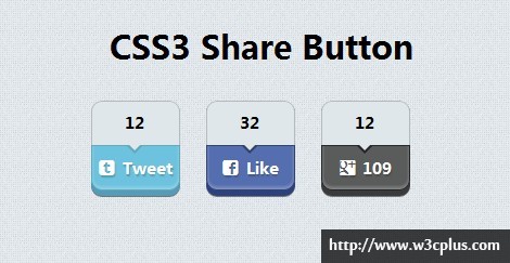
首先非常感谢藤藤提供的代码,是她用CSS3写的一个分享按钮的效果,而且写得非常不错。结过她的同意,我稍加做了点点的修改,增加了ICON图标上去,让效果看上去更清晰一些。在这个效果中主要使用了:CSS3的伪类选择器(伪元素)、box-shadow和@font-face三个属性,结过颜色细腻的搭配,制作了这么一个完美的分享按钮。
HTML Code
<div class="box">
  <a href="#">
    <span>12</span>
    <span>Tweet</span>
  </a>
  <a href="#">
    <span>32</span>
    <span>Like</span>
  </a>
  <a href="#">
    <span>12</span>
    <span>109</span>
  </a>
</div>
CSS Code
/*share button*/
@font-face {
  font-family: 'fontello';
  src: url("font/fontello.eot");
  src: url("font/fontello.eot?#iefix") format('embedded-opentype'), url("font/fontello.woff") format('woff'), url("font/fontello.ttf") format('truetype'), url("font/fontello.svg#fontello") format('svg');
  font-weight: normal;
  font-style: normal;
}
.box {
  width: 960px;
  margin:20px auto;
  text-align:center;
}
.box a{
  display: inline-block;
  width: 80px;
  height: 80px;
  background:#dfe7ea;
  border-radius: 10px;
  border:1px solid #b5babe;
  text-align: center;
  margin-right: 20px;
  font-weight: bold;
  position: relative;
  box-shadow:0 1px 0 rgb(85, 156, 184),0 2px 0 rgb(85, 156, 184),0 3px 0 rgb(85, 156, 184),0 4px 0 rgb(85, 156, 184),0 6px 0 rgb(85, 156, 184),0 7px 0 rgba(0, 0, 0, 0.5);
  text-decoration: none;
}
.box a:nth-of-type(2){
  box-shadow:0 1px 0 rgb(45, 65, 126),0 2px 0 rgb(45, 65, 126),0 3px 0 rgb(45, 65, 126),0 4px 0 rgb(45, 65, 126),0 6px 0 rgb(45, 65, 126),0 7px 0 rgba(0, 0, 0, 0.5);
}
.box a:nth-of-type(3){
  box-shadow: 0 1px 0 rgb(58, 59, 61),0 2px 0 rgb(58, 59, 61),0 3px 0 rgb(58, 59, 61),0 4px 0 rgb(58, 59, 61),0 6px 0 rgb(58, 59, 61),0 7px 0 rgba(0, 0, 0, 0.5);
}
.box a span{
  height: 40px;
  display:block;
  width: 80px;
  margin-left: -1px;
  color: #000;
}
.box a span:first-child{
  position: relative;
}
.box a span:first-child:after,
.box a span:first-child:before{
  display: block;
  content: "";
  position: absolute;
  width: 0;
  height: 0;
  left: 50%;
  border-style: solid;
  z-index: 9;
}
.box a span:first-child:before{
  border-color:#63a9b5 transparent transparent transparent;
  border-width: 8px;
  bottom:-16px;
  margin-left:-8px;
}
.box a span:first-child:after{
  border-color: #dfe7ea transparent transparent transparent;
  border-width: 6px;
  bottom:-11px;
  margin-left:-6px;
}

.box a:nth-of-type(2) span:first-child:before{
  border-color:#354267 transparent transparent transparent;
}
.box a:nth-of-type(3) span:first-child:before{
  border-color:#252629 transparent transparent transparent;
}
.box a span:last-child{
  color: #fff;
  box-shadow:inset 0 -2px 4px rgba(255,255,255,.3);
  border-radius: 0 0 10px 10px;
  background:#6dc2df;
  border: 1px solid #64aab6;
  text-shadow:1px 2px 1px rgba(0,0,0,.2);
  position: relative;
  z-index: 0;
}

.box a:nth-of-type(2) span:last-child{
  background:#556eb0;
  border: 1px solid #354267;
}
.box a:nth-of-type(3) span:last-child{
  background:#5a5c5b;
  border: 1px solid #252629;
}

.box a span:last-child:before {
  font-family: 'fontello';
  font-style: normal;
  font-weight: normal;
  speak: none;
  display: inline-block;
  text-decoration: inherit;
  width: 1em;
  margin-right: 0.4em;
  text-align: center;
  vertical-align: 1px;
}
.box a:nth-of-type(1) span:last-child:before{ content: '\f310'; }
.box a:nth-of-type(2) span:last-child:before { content: '\f301'; }
.box a:nth-of-type(3) span:last-child:before { content: '\f309'; }
再次感谢藤藤的分享。希望有更多的同学参与我们的CSS3案例分享当中来,用你的创意,带动大家一起学习CSS3。
如需转载,烦请注明出处:http://www.w3cplus.com/demo/css3-share-button.html


