

CSS3制作三角TIP框
作者:大漠 日期:2012-08-28 点击:1553

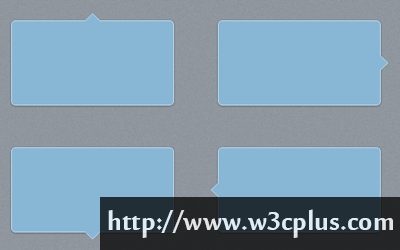
sofish在《CSS quiz: 带边 border 的三角形》制作介绍了使用border制作三角的兼容方案,很实用的一个东东。目前这种效果在Web中的运用是越来越多,有很多同学也想尽办法:有使用图片的,有使用border的,当然还有使用其他方法的。今天我要为大家介绍的是使用“::after”和"::before"配合border制作带边三角提示框,并为大家推荐一个在线制作工具。只不过这种方法不兼容IE8以及其以下的浏览器。如果要兼容IE,建议使用sofish的方法。
别的不多说,直接上代码:
HTML Code
<div class="arrow_box top"></div>
<div class="arrow_box right"></div>
<div class="arrow_box bottom"></div>
<div class="arrow_box left"></div>
CSS Code
.arrow_box {
	position: relative;
	background: #88b7d5;
	border: 1px solid #c2e1f5;
	padding: 10px;
	width: 200px;
	height: 100px;
	border-radius: 6px;
	box-shadow: 0 1px 4px rgba(0, 0, 0, 0.3);
	margin: 30px;
	float: left;
}
.arrow_box::after,
.arrow_box::before {
	position:absolute;
	content:"";
	height:0;
	width: 0;
	pointer-events: none;
	border: solid transparent;
}
/*top*/
.arrow_box.top::after,
.arrow_box.top::before {
	bottom: 100%;
}

.arrow_box.top::after {
	border-color: rgba(136, 183, 213, 0);
	border-bottom-color: #88b7d5;
	border-width: 10px;
	left: 50%;
	margin-left: -10px;
}
.arrow_box.top::before {
	border-color: rgba(194, 225, 245, 0);
	border-bottom-color: #c2e1f5;
	border-width: 11px;
	left: 50%;
	margin-left: -11px;
}
/*right*/
.arrow_box.right::after,
.arrow_box.right::before {
	left: 100%;
}

.arrow_box.right::after {
	border-color: rgba(136, 183, 213, 0);
	border-left-color: #88b7d5;
	border-width: 10px;
	top: 50%;
	margin-top: -10px;
}
.arrow_box.right::before {
	border-color: rgba(194, 225, 245, 0);
	border-left-color: #c2e1f5;
	border-width: 11px;
	top: 50%;
	margin-top: -11px;
}
/*bottom*/

.arrow_box.bottom::after,
.arrow_box.bottom::before {
	top: 100%;
}

.arrow_box.bottom::after {
	border-color: rgba(136, 183, 213, 0);
	border-top-color: #88b7d5;
	border-width: 10px;
	left: 50%;
	margin-left: -10px;
}
.arrow_box.bottom::before {
	border-color: rgba(194, 225, 245, 0);
	border-top-color: #c2e1f5;
	border-width: 11px;
	left: 50%;
	margin-left: -11px;
}
/*left*/
.arrow_box.left::after,
.arrow_box.left::before {
	right: 100%;
}

.arrow_box.left::after {
	border-color: rgba(136, 183, 213, 0);
	border-right-color: #88b7d5;
	border-width: 10px;
	top: 50%;
	margin-top: -10px;
}
.arrow_box.left::before {
	border-color: rgba(194, 225, 245, 0);
	border-right-color: #c2e1f5;
	border-width: 11px;
	top: 50%;
	margin-top: -11px;
}
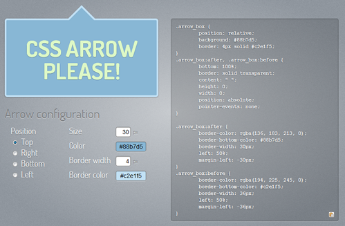
这里向大家推荐一个在线制作工个:CSS ARROW PLEASE!
扩展阅读:
- CSS制作图形速查表
- 纯CSS制作的图形效果
- 纯css三角效果代码
- Pure CSS speech bubbles
- CSS Quick Tip: CSS Arrows and Shapes Without Markup
- the best pure CSS3 iOS style arrow “Back” button
- CSS常用浮出层的写法
- Speech Bubble Arrows that Inherit Parent Color
- Style a Select Box Using Only CSS
- nudgenudge
- How to Make a Pure CSS Speech Bubble With a Drop Shadow
- Creating Triangles in CSS
如需转载,烦请注明出处:http://www.w3cplus.com/demo/cssarrowplease.html


