css3加载动画2
作者:结一 日期:2012-08-27 点击:1168

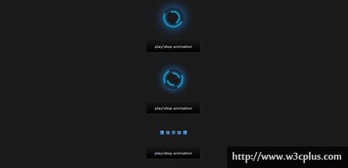
其实分析每个css3的案例动画,首先做的应该是先把动画停下来,了解下初始是怎么样的。如这个我们一开始看到这么绚的动画加载效果,一般都认为比较难,但是先把animation这个属性通过firebug禁用后,发现原来原理并不是很复杂,只是运用了border,border-radius和box-shadow,然后给就是rotate的animation。第二个和第一个原理一样,只是设置的border-color四个值不一样罢了。而第三个则是使用不同的延迟时间引发scale的动画。至于暂停按钮则是通过js来添加stop这个class,stop则设置了animation-play-state:paused;
css主要代码为:
/* STOP ANIMATION */

.stop {
	-webkit-animation-play-state:paused;
	-moz-animation-play-state:paused;
}

/* Loading Circle */
.ball {
	background-color: rgba(0,0,0,0);
	border:5px solid rgba(0,183,229,0.9);
	opacity:.9;
	border-top:5px solid rgba(0,0,0,0);
	border-left:5px solid rgba(0,0,0,0);
	border-radius:50px;
	box-shadow: 0 0 35px #2187e7;
	width:50px;
	height:50px;
	margin:0 auto;
	-moz-animation:spin .5s infinite linear;
	-webkit-animation:spin .5s infinite linear;
}

.ball1 {
	background-color: rgba(0,0,0,0);
	border:5px solid rgba(0,183,229,0.9);
	opacity:.9;
	border-top:5px solid rgba(0,0,0,0);
	border-left:5px solid rgba(0,0,0,0);
	border-radius:50px;
	box-shadow: 0 0 15px #2187e7;
	width:30px;
	height:30px;
	margin:0 auto;
	position:relative;
	top:-50px;
	-moz-animation:spinoff .5s infinite linear;
	-webkit-animation:spinoff .5s infinite linear;
}

@-moz-keyframes spin {
	0% { -moz-transform:rotate(0deg); }
	100% { -moz-transform:rotate(360deg); }
}
@-moz-keyframes spinoff {
	0% { -moz-transform:rotate(0deg); }
	100% { -moz-transform:rotate(-360deg); }
}
@-webkit-keyframes spin {
	0% { -webkit-transform:rotate(0deg); }
	100% { -webkit-transform:rotate(360deg); }
}
@-webkit-keyframes spinoff {
	0% { -webkit-transform:rotate(0deg); }
	100% { -webkit-transform:rotate(-360deg); }
}

/* Second Loadin Circle */

.circle {
	background-color: rgba(0,0,0,0);
	border:5px solid rgba(0,183,229,0.9);
	opacity:.9;
	border-right:5px solid rgba(0,0,0,0);
	border-left:5px solid rgba(0,0,0,0);
	border-radius:50px;
	box-shadow: 0 0 35px #2187e7;
	width:50px;
	height:50px;
	margin:0 auto;
	-moz-animation:spinPulse 1s infinite ease-in-out;
	-webkit-animation:spinPulse 1s infinite linear;
}
.circle1 {
	background-color: rgba(0,0,0,0);
	border:5px solid rgba(0,183,229,0.9);
	opacity:.9;
	border-left:5px solid rgba(0,0,0,0);
	border-right:5px solid rgba(0,0,0,0);
	border-radius:50px;
	box-shadow: 0 0 15px #2187e7;
	width:30px;
	height:30px;
	margin:0 auto;
	position:relative;
	top:-50px;
	-moz-animation:spinoffPulse 1s infinite linear;
	-webkit-animation:spinoffPulse 1s infinite linear;
}

@-moz-keyframes spinPulse {
	0% { -moz-transform:rotate(160deg); opacity:0; box-shadow:0 0 1px #2187e7;}
	50% { -moz-transform:rotate(145deg); opacity:1; }
	100% { -moz-transform:rotate(-320deg); opacity:0; }
}
@-moz-keyframes spinoffPulse {
	0% { -moz-transform:rotate(0deg); }
	100% { -moz-transform:rotate(360deg);  }
}
@-webkit-keyframes spinPulse {
	0% { -webkit-transform:rotate(160deg); opacity:0; box-shadow:0 0 1px #2187e7; }
	50% { -webkit-transform:rotate(145deg); opacity:1;}
	100% { -webkit-transform:rotate(-320deg); opacity:0; }
}
@-webkit-keyframes spinoffPulse {
	0% { -webkit-transform:rotate(0deg); }
	100% { -webkit-transform:rotate(360deg); }
}

/* LITTLE BAR */

.barlittle {
	background-color:#2187e7;
	background-image: -moz-linear-gradient(45deg, #2187e7 25%, #a0eaff);
	background-image: -webkit-linear-gradient(45deg, #2187e7 25%, #a0eaff);
	border-left:1px solid #111; border-top:1px solid #111; border-right:1px solid #333; border-bottom:1px solid #333;
	width:10px;
	height:10px;
	float:left;
	margin-left:5px;
    opacity:0.1;
	-moz-transform:scale(0.7);
	-webkit-transform:scale(0.7);
	-moz-animation:move 1s infinite linear;
	-webkit-animation:move 1s infinite linear;
}
#block_1{
 	-moz-animation-delay: .4s;
	-webkit-animation-delay: .4s;
 }
#block_2{
 	-moz-animation-delay: .3s;
	-webkit-animation-delay: .3s;
}
#block_3{
 	-moz-animation-delay: .2s;
	-webkit-animation-delay: .2s;
}
#block_4{
 	-moz-animation-delay: .3s;
	-webkit-animation-delay: .3s;
}
#block_5{
 	-moz-animation-delay: .4s;
	-webkit-animation-delay: .4s;
}
@-moz-keyframes move{
	0%{-moz-transform: scale(1.2);opacity:1;}
	100%{-moz-transform: scale(0.7);opacity:0.1;}
}
@-webkit-keyframes move{
	0%{-webkit-transform: scale(1.2);opacity:1;}
	100%{-webkit-transform: scale(0.7);opacity:0.1;}
}
查看更多:http://www.alessioatzeni.com/blog/css3-loading-animation-loop/