

Add To Car Button
作者:白牙 日期:2013-02-01 点击:372

这个Demo是一位在校大三的学生白牙制作的,从今天开始白牙同学也将为大家带来很多CSS3的DEMO效果,将会涉及各个方面的UI效果,比如说常见的Button UI,Form UI,Menu UI等等。同样这些CSS3 UI效果都是将国外的一些优秀的UI设计图(psd)转换成CSS代码,让更多的学习受益,同时将在W3cplus上打造一个优秀的UI库,这个库里的代码可以随时使用,可以随时拿来学习。
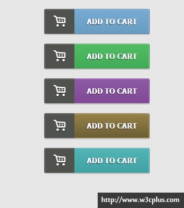
白牙第一次给大家带来的案例是通过CSS3的渐变属性、阴影、CSS3的伪类和@font-face属性制作的添加物品到购物车的效果。如果你喜欢就往下看吧。
HTML结构
制作这个效果所需的结构非常的简单,就是一个Button标签,当然也有人使用a标签制作。
<button name="add to card" type="button" class="blue">add to cart</button>
<button name="add to card" type="button" class="green">add to cart</button>
<button name="add to card" type="button" class="purple">add to cart</button>
<button name="add to card" type="button" class="yellow">add to cart</button>
<button name="add to card" type="button" class="blueness">add to cart</button>
不产同的颜色按钮设置了一个颜色类名,比如此处所示的“blue”、“green”、“purple”、“yellow”和“blueness”,大家可以根据自己的所需,定义适合自己的类名。
CSS代码
这里使用的CSS相对简单,就是几个知识点,也是大家常见的。
/*默认样式*/
body {
  background-color:rgb(230,230,230);
}
.demo {
  width: 235px;
  margin: 50px auto;
}
/*按钮基本样式*/
button {
  line-height:48px;
  padding:0 25px 0 85px;
  position:relative;
  color:#fff;
  border:none;
  border-radius:3px;/*按钮圆角实现*/
  font-size:15px;
  font-weight:bold;
  text-transform:uppercase;
  text-shadow: 0 1px 1px rgba(0,0,0,0.8);/*文字阴影*/
  margin:10px;
}
/*使用伪类制作购物车*/
button:before {
  content:"b";
  font-family:'cart-icon';
  font-size:30px;
  text-transform:none;
  text-shadow: 0 1px 0 rgba(0,0,0,1);
  position:absolute;
  left:-1px;
  top:-1px;
  background-color:rgb(80,82,78);
  height:48px;
  width:60px;
  color:#fff;
  border-radius:3px 0 0 3px;
  border:1px solid rgb(75,75,75);
  border-right:none;
  box-shadow:inset 1px 1px 0 rgb(120,120,120);/*盒子阴影*/
  z-index: 3;
}
/*蓝色按钮效果*/
.blue {
  background-image:-*-linear-gradient(top,rgb(120,170,210),rgb(104,157,193));
  border:1px solid rgb(81,132,171);
  box-shadow: inset -1px 1px 0 rgb(154,194,221),0 1px 0 rgb(182,182,180),0 2px 0 rgb(197,195,197),0 3px 0 rgb(211,213,210);
}
/*绿色按钮效果*/
.green {
  background-image:-*-linear-gradient(top,rgb(80,188,98),rgb(65,172,86));
  border:1px solid rgb(64,152,80);
  box-shadow: inset -1px 1px 0 rgb(137,207,152),0 1px 0 rgb(182,182,180),0 2px 0 rgb(197,195,197),0 3px 0 rgb(211,213,210);
}
/*黄色按钮效果*/
.yellow {
  background-image:-*-linear-gradient(top,rgb(150,130,72),rgb(108,94,53));
  border:1px solid rgb(147,129,75);
  box-shadow: inset -1px 1px 0 rgb(170,163,123),0 1px 0 rgb(182,182,180),0 2px 0 rgb(197,195,197),0 3px 0 rgb(211,213,210);
}
/*紫色按钮效果*/
.purple {
  background-image:-*-linear-gradient(top,rgb(140,90,164),rgb(130,73,149));
  border:1px solid rgb(155,90,175);
  box-shadow: inset -1px 1px 0 rgb(160,120,180),0 1px 0 rgb(182,182,180),0 2px 0 rgb(197,195,197),0 3px 0 rgb(211,213,210);
}
/*浅蓝色按钮*/
.blueness {
  background-image:-*-linear-gradient(top,rgb(82,180,181),rgb(65,162,163));
  border:1px solid rgb(73,163,167);
  box-shadow: inset -1px 1px 0 rgb(128,199,199),0 1px 0 rgb(182,182,180),0 2px 0 rgb(197,195,197),0 3px 0 rgb(211,213,210);
}
/*调用服务器字库制作icon*/
@font-face {
  font-family: 'cart-icon';
  src: url('font/cart-icon.eot');
  src: url('font/cart-icon.eot?#iefix') format('embedded-opentype'),
  url('font/cart-icon.svg#cart-icon') format('svg'),
  url('font/cart-icon.woff') format('woff'),
  url('font/cart-icon.ttf') format('truetype');
  font-weight: normal;
  font-style: normal;
}
关于白牙
网络昵称白牙,大三学生,就读于华南师范大学,现居广州。对HTML5、CSS3、javascript、前端UI开发有浓厚兴趣。请关注我:新浪微博
如需转载,烦请注明出处:http://www.w3cplus.com/demo/add-to-cart-button.html


