

藤藤每日一练——CSS3制作手风琴菜单
作者:藤藤 日期:2012-11-27 点击:689

早期制作手风琴菜单都需要依赖于js的脚本来实现,自从CSS3出现后,制作这种效果不在需要依赖于任何脚本。另外实现手风琴效果的制作方法有很多种,但较为常见的是使用css3的“:target”选择器来实现。在本例中也是一样的,通过“:target”选择器来控制下接菜单的“max-height”,原理简单,方法也简单,只是细节处理稍加注意。
HTML Code
<ul class="menu">
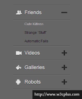
<li class="item1" id="one"><a href="#one">Friends </a>
<ul>
<li class="subitem1"><a href="#">Cute Kittens </a></li>
<li class="subitem2"><a href="#">Strange “Stuff” </a></li>
<li class="subitem3"><a href="#">Automatic Fails </a></li>
</ul>
</li>
<li class="item2" id="two"><a href="#two">Videos </a>
<ul>
<li class="subitem1"><a href="#">Cute Kittens </a></li>
<li class="subitem2"><a href="#">Strange “Stuff” </a></li>
<li class="subitem3"><a href="#">Automatic Fails </a></li>
<li class="subitem2"><a href="#">Strange “Stuff” </a></li>
<li class="subitem1"><a href="#">Cute Kittens </a></li>
<li class="subitem2"><a href="#">Strange “Stuff” </a></li>
</ul>
</li>
<li class="item3" id="three"><a href="#three">Galleries</a>
<ul>
<li class="subitem3"><a href="#">Automatic Fails</a></li>
</ul>
</li>
<li class="item5" id="five"><a href="#five">Robots</a>
<ul>
<li class="subitem1"><a href="#">Cute Kittens</a></li>
<li class="subitem2"><a href="#">Strange “Stuff”</a></li>
<li class="subitem3"><a href="#">Automatic Fails </a></li>
</ul>
</li>
</ul>
CSS Code
body {
  background-color: #666;
}
.demo {
  width: 200px;
  height: 400px;
  margin: 40px auto 0;
}
.menu > li {
  line-height: 50px;
  border-bottom: 1px solid #3d3d3d;
  box-shadow: 0 1px 0 #888;
}
.menu > li:first-child {
  border-top: 1px solid #3d3d3d;
  box-shadow: 0 1px 0 #888,0 1px 0 #888 inset;
}
.menu a {
  position: relative;
  outline: 0;
  display: block;
  text-align: left;
  color: #e5e5e5;
  font-size: 18px;
  text-shadow: 0 1px 1px #171717;
  padding: 0 40px;
}
.menu a:hover {
  text-decoration: none;
}
.menu > li > a:before,
  .menu > li > a:after {
  font-family: 'LigatureSymbols';
  text-rendering: optimizeLegibility;
  -webkit-font-smoothing: antialiased;
  -moz-font-smoothing: antialiased;
  -ms-font-smoothing: antialiased;
  -o-font-smoothing: antialiased;
  font-smoothing: antialiased;
  -webkit-font-feature-settings: "liga" 1, "dlig" 1;
  -moz-font-feature-settings: "liga=1, dlig=1";
  -ms-font-feature-settings: "liga" 1, "dlig" 1;
  font-feature-settings: "liga" 1, "dlig" 1;
  font-size: 26px;
}
.menu > li > a:before {
  position: absolute;
  left: 10px;
  color: #e5e5e5;
  text-shadow: inherit -1px 0 #fff,0 -2px 0 #1a1a1a,0 1px 2px #1a1a1a;
}
.menu > li > a:after {
  position: absolute;
  right: 10px;
  color: #292929;
  text-shadow: -1px 0 0 #050505,1px 0 0 #868686;
}
.menu > li:nth-child(1) > a:before{
  content:"friend";
}
.menu > li:nth-child(2) > a:before{
  content:"video";
}
.menu > li:nth-child(3) > a:before{
  content:"paint";
}
.menu > li:nth-child(4) > a:before{
  content:"android";
}
.menu > li > a:after{
  content:"plus";
}
.menu ul {
  line-height: 30px;
  max-height: 0;
  overflow: hidden;
  -webkit-transition: max-height .5s linear;
  -moz-transition: max-height .5s linear;
   transition: max-height .5s linear;
}
.menu ul a {
  color: #000;
  text-shadow: 0 1px 1px #848484;
  font-size: 12px;
}
.menu ul a:hover {
  color: #ccc;
  text-shadow: 0 1px 0 #252525;
}
.menu li:target > a:after {
  content: "minus";
}
.menu li:target ul {
  max-height: 200px;
  border-top: 1px solid #3d3d3d;
  box-shadow: 0 1px 0 #888 inset;
}
@font-face {
    font-family: 'LigatureSymbols';
    src: url('font/LigatureSymbols-2.05.eot');
    src: url('font/LigatureSymbols-2.05.eot?#iefix') format('embedded-opentype'),
      url('font/LigatureSymbols-2.05.woff') format('woff'),
      url('font/LigatureSymbols-2.05.ttf') format('truetype'),
      url('font/LigatureSymbols-2.05.svg#LigatureSymbols') format('svg');
    font-weight: normal;
    font-style: normal;
}
如需转载,烦请注明出处:http://www.w3cplus.com/demo/css3-categories-menu-html


