CSS3制作秒表
作者:大漠 日期:2012-11-09 点击:984

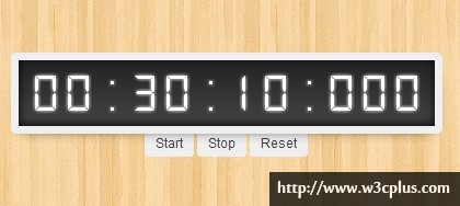
CSS3制作秒表效果,以前想都不敢想,但thecodeplayer.com却完美的使用了CSS3中的animation属性制作了一个纯CSS3的秒表计时器的效果,让我们想都不敢想象,曾经需要javaScript的效果,如今使用CSS3的几个属性就完成了。在这个效果中主要是控制时间数字的显示,本例中每个数定的宽度和高度都定死了,其动画实现主要逻辑是通过对数字进行绝对定位,依靠改变数字的“top”属性值来实现时间数字的变更,当关还需要大家计算好他们之间转换的速率。所以说这个例子绝对是一个练习CSS3的animation属性的好例子,你要是掌握了这个例子,我想你对animation会有一个质的认识,希望大家喜欢(^_^)。
HTML CODE
<div class="container">
  <!-- time to add the controls -->
  <input id="start" name="controls" type="radio" />
  <input id="stop" name="controls" type="radio" />
  <input id="reset" name="controls" type="radio" />
  <div class="timer">
    <div class="cell">
      <div class="numbers tenhour moveten">0 1 2 3 4 5 6 7 8 9</div>
    </div>
    <div class="cell">
      <div class="numbers hour moveten">0 1 2 3 4 5 6 7 8 9</div>
    </div>
    <div class="cell divider"><div class="numbers">:</div></div>
    <div class="cell">
      <div class="numbers tenminute movesix">0 1 2 3 4 5 6</div>
    </div>
    <div class="cell">
      <div class="numbers minute moveten">0 1 2 3 4 5 6 7 8 9</div>
    </div>
    <div class="cell divider"><div class="numbers">:</div></div>
    <div class="cell">
      <div class="numbers tensecond movesix">0 1 2 3 4 5 6</div>
    </div>
    <div class="cell">
      <div class="numbers second moveten">0 1 2 3 4 5 6 7 8 9</div>
    </div>
    <div class="cell divider"><div class="numbers">:</div></div>
    <div class="cell">
      <div class="numbers milisecond moveten">0 1 2 3 4 5 6 7 8 9</div>
    </div>
    <div class="cell">
      <div class="numbers tenmilisecond moveten">0 1 2 3 4 5 6 7 8 9</div>
    </div>
    <div class="cell">
      <div class="numbers hundredmilisecond moveten">0 1 2 3 4 5 6 7 8 9</div>
    </div>
  </div>
  <!-- Lables for the controls -->
  <div id="timer_controls">
  <label for="start">Start</label>
  <label for="stop">Stop</label>
  <label for="reset">Reset</label>
</div>
CSS CODE
body{
 background: url('wood_pattern.png') repeat;
}
.container {
 padding: 50px;
 text-align: center;
}

.timer {
 padding: 10px;
 background: -webkit-linear-gradient(top, #222, #444);
 background: -moz-linear-gradient(top, #222, #444);
 background: -ms-linear-gradient(top, #222, #444);
 background: -o-linear-gradient(top, #222, #444);
 background: linear-gradient(top, #222, #444);
 overflow: hidden;
 display: inline-block;
 border: 7px solid #efefef;
 border-radius: 5px;
 position: relative;
 box-shadow: inset 0 -2px 10px 1px rgba(0, 0, 0, 0.75), 0 5px 20px -10px rgba(0, 0, 0, 1);
}

.cell {
 /*只显示一位数字. 高度 = 数字的行高,宽度 = 数字的宽度*/
 width: 0.60em;
 height: 40px;
 font-size: 50px;
 overflow: hidden;
 position: relative;
 float: left;
}
.numbers {
 width: 0.6em;
 line-height: 40px;
 font-family: digital, arial, verdana;
 text-align: center;
 color: #fff;
 position: absolute;
 top: 0;
 left: 0;
 /*数字发光效果*/
 text-shadow: 0 0 5px rgba(255, 255, 255, 1);
}
/*秒表控制器样式*/
#timer_controls {
 margin-top: -5px;
}
#timer_controls label {
 cursor: pointer;
 padding: 5px 10px;
 background: #efefef;
 font-family: arial, verdana, tahoma;
 font-size: 11px;
 border-radius: 0 0 3px 3px;
}
input[name="controls"] {display: none;}

/*Control code*/
/*秒表暂停运转*/
#stop:checked~.timer .numbers {
 -webkit-animation-play-state: paused;
 -moz-animation-play-state: paused;
 -o-animation-play-state: paused;
 -ms-animation-play-state: paused;
 animation-play-state: paused;
}
/*秒表开始运转*/
#start:checked~.timer .numbers {
  -webkit-animation-play-state: running;
  -moz-animation-play-state: running;
  -o-animation-play-state: running;
  -ms-animation-play-state: running;
  animation-play-state: running;
}
/*重置秒表*/
#reset:checked~.timer .numbers {
  -webkit-animation: none;
  -moz-animation: none;
  -o-animation: none;
  -ms-animation: none;
  animation: none;
}

.moveten {
 /*使用分步骤来移动数字,10个数字等于10步*/
 -webkit-animation: moveten 1s steps(10, end) infinite;
 -moz-animation: moveten 1s steps(10, end) infinite;
 -o-animation: moveten 1s steps(10, end) infinite;
 -ms-animation: moveten 1s steps(10, end) infinite;
 animation: moveten 1s steps(10, end) infinite;
 /*默认情况下动画是停止不动的*/
 -webkit-animation-play-state: paused;
 -moz-animation-play-state: paused;
 -o-animation-play-state: paused;
 -ms-animation-play-state: paused;
 animation-play-state: paused;
}
.movesix {
 -webkit-animation: movesix 1s steps(6, end) infinite;
 -moz-animation: movesix 1s steps(6, end) infinite;
 -o-animation: movesix 1s steps(6, end) infinite;
 -ms-animation: movesix 1s steps(6, end) infinite;
 animation: movesix 1s steps(6, end) infinite;
}

/*同步时间的速率*/
/*每秒十个数字,因此也需要十步*/
.second {
 -webkit-animation-duration: 10s;
 -moz-animation-duration: 10s;
 -o-animation-duration: 10s;
 -ms-animation-duration: 10s;
 animation-duration: 10s;
}
.tensecond {
  /*60 times .second*/
  -webkit-animation-duration: 60s;
  -moz-animation-duration: 60s;
  -o-animation-duration: 60s;
  -ms-animation-duration: 60s;
  animation-duration: 60s;
}

.milisecond {
  /*1/10th of .second*/
  -webkit-animation-duration: 1s;
 -moz-animation-duration: 1s;
 -o-animation-duration: 1s;
 -ms-animation-duration: 1s;
 animation-duration: 1s;
}
.tenmilisecond {
  -webkit-animation-duration: 0.1s;
  -moz-animation-duration: 0.1s;
  -ms-animation-duration: 0.1s;
  -o-animation-duration: 0.1s;
  animation-duration: 0.1s;
}
.hundredmilisecond {
  -webkit-animation-duration: 0.01s;
  -moz-animation-duration: 0.01s;
  -o-animation-duration: 0.01s;
  -ms-animation-duration: 0.01s;
  animation-duration: 0.01s;
}

.minute {
  /*60 times .second*/
  -webkit-animation-duration: 600s;
 -moz-animation-duration: 600s;
 -o-animation-duration: 600s;
 -ms-animation-duration: 600s;
 animation-duration: 600s;
}
.tenminute {
  /*60 times .minute*/
  -webkit-animation-duration: 3600s;
 -moz-animation-duration: 3600s;
 -ms-animation-duration: 3600s;
 -o-animation-duration: 3600s;
 animation-duration: 3600s;
}

.hour {
  /*60 times .minute*/
  -webkit-animation-duration: 36000s;
 -moz-animation-duration: 36000s;
 -ms-animation-duration: 36000s;
 -o-animation-duration: 36000s;
 animation-duration: 36000s;
}
.tenhour {
  /*10 times .hour*/
  -webkit-animation-duration: 360000s;
 -moz-animation-duration: 360000s;
 -o-animation-duration: 360000s;
 -ms-animation-duration: 360000s;
 animation-duration: 360000s;
}

/*------------------------------------------------------------*\
1、动画的逻辑就是给数字使用了绝对定位,改变“top”的属性值;
2、分 和 秒 应该是 '60' 而不是 '100',因此需要创建两个动画;
3、十步十个数字
4、六步六个数字
\*-------------------------------------------------------------*/
@-webkit-keyframes moveten {
 0% {top: 0;}
 100% {top: -400px;}
 /*height = 40. digits = 10. hence -400 to move it completely to the top*/
}

@-webkit-keyframes movesix {
 0% {top: 0;}
 100% {top: -240px;}
 /*height = 40. digits = 6. hence -240 to move it completely to the top*/
}

@-moz-keyframes moveten {
 0% {top: 0;}
 100% {top: -400px;}
 /*height = 40. digits = 10. hence -400 to move it completely to the top*/
}

@-moz-keyframes movesix {
 0% {top: 0;}
 100% {top: -240px;}
 /*height = 40. digits = 6. hence -240 to move it completely to the top*/
}
@-o-keyframes moveten {
 0% {top: 0;}
 100% {top: -400px;}
 /*height = 40. digits = 10. hence -400 to move it completely to the top*/
}
@-o-keyframes movesix {
 0% {top: 0;}
 100% {top: -240px;}
/*height = 40. digits = 6. hence -240 to move it completely to the top*/
}
@-ms-keyframes moveten {
 0% {top: 0;}
 100% {top: -400px;}
 /*height = 40. digits = 10. hence -400 to move it completely to the top*/
}

@-ms-keyframes movesix {
 0% {top: 0;}
 100% {top: -240px;}
 /*height = 40. digits = 6. hence -240 to move it completely to the top*/
}
@keyframes moveten {
 0% {top: 0;}
 100% {top: -400px;}
 /*height = 40. digits = 10. hence -400 to move it completely to the top*/
}

@keyframes movesix {
 0% {top: 0;}
 100% {top: -240px;}
 /*height = 40. digits = 6. hence -240 to move it completely to the top*/
}
/*Lets use a better font for the numbers*/
@font-face {
 font-family: 'digital';
 src: url('http://thecodeplayer.com/uploads/fonts/DS-DIGI.TTF');
}
此案例代码来自于thecodeplayer.com,并做过相应的代码处理。
如需转载,烦请注明出处:http://www.w3cplus.com/demo/pure-css3-create-a-stopwatch.html