

Tabs with Round Out Borders
作者:大漠 日期:2012-09-26 点击:252

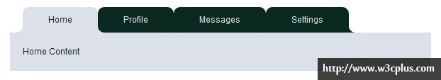
这个效果和前面藤藤制作的CSS3制作Twitter信息框是一样的,不过比她的效果简单一些,再次放上来的目的是写了一篇《Tabs with Round Out Borders》博文,主要针对的就是这种效果的制作思路与细节。在这个效果中主要运用的是元素的“:after”和“:before”来制作tabs的底部内凹圆角效果。
HTML结构:
<ul class="nav nav-tabs" id="myTab">
  <li class="active"><a href="#home">Home</a></li>
  <li><a href="#profile">Profile</a></li>
  <li><a href="#messages">Messages</a></li>
  <li><a href="#settings">Settings</a></li>
</ul>

<div class="tab-content">
  <div class="tab-pane active" id="home">...</div>
  <div class="tab-pane" id="profile">...</div>
  <div class="tab-pane" id="messages">...</div>
  <div class="tab-pane" id="settings">...</div>
</div>
CSS代码
.demo {
  width: 660px;
  margin: 20px auto;
}
.nav:after,
.nav:before {
  content:"";
  display: table;
}
.nav:after {
  clear:both;
  overflow:hidden;
}
.nav {
  zoom: 1;
  margin-left: 20px;
}
.nav li {
  list-style: none outside none;
  float: left;
  position: relative;/*这个很重要*/
}
.nav .active {
  z-index: 3;/*当前项在最顶端*/
}
.nav li:before,
.nav li:after,
.nav  a:before,
.nav  a:after {
  content:"";
  position: absolute;
  bottom:0;

}
.nav li:before,
.nav li:after {
  background: rgb(10, 41, 30);
  width: 10px;
  height: 10px;
}
.nav li:before {
  left: -10px;
}
.nav li:after {
  right: -10px;
}
.nav a {
  float: left;
  padding: 10px 40px;
  text-decoration: none;
  color: rgb(220, 225, 233);
  background: rgb(10, 41, 30);
  border-radius: 10px 10px 0 0;
}
.nav .active a {
  background: rgb(220, 225, 233);
  color:rgb(10, 41, 30);
}

.nav  a:before,
.nav  a:after {
  width: 20px;
  height: 20px;
  border-radius: 10px;
  background: rgb(10, 41, 30);
  z-index: 2;/*圆形在矩形上面*/
}
.nav .active a:before,
.nav .active a:after {
  background: rgb(10, 41, 30);
}
.nav  a:before {
  left:-20px;
}
.nav  a:after {
  right: -20px;
}
/*当前项的:after和:before的z-index值为1*/
.nav .active:before,
.nav .active:after {
  z-index: 1;/*当前项的矩形在圆形下面*/
  background: rgb(220, 225, 233);
}
/*第一个选项卡的:before和最后一个选项卡的:after背景色不一样*/
.nav li:first-child a:before,
.nav li:last-child a:after {
  background-color: #fff;
}
.tab-content {
  background: rgb(220, 225, 233);
  color:rgb(10, 41, 30);
  padding: 20px;
}
.tab-pane {
  display: none;
}
.tab-pane.active {
  display: block;
}
jQuery代码:
<script type="text/javascript" src="jquery.js"></script>
<script type="text/javascript" src="bootstrap-tab.js"></script>
<script type="text/javascript">
  $(function(){
    $('#myTab a').click(function (e) {
      e.preventDefault();
      $(this).tab('show');
    })
  });
</script>
详细介绍请参阅:《Tabs with Round Out Borders》一文。
如需转载,烦请注明出处:http://www.w3cplus.com/demo/tabs-with-round-out-border.html


