

藤藤每日一练——CSS3制作登录表单
作者:大漠 日期:2012-09-19 点击:236

W3cplus从今天刚开推出藤藤练习的CSS3系列。出这个系列主要是为了让同样有着CSS3兴趣的同学更有动力,在这个系列中都是由W3cplus美女成员藤藤每天根据国外搜集的有关psd设计图,然后将设计图通过css3的代码转换成DEMO案例。一是为了自己提高,二是与其他有同样爱好的同学一起分享。如果你喜欢,那就持续关注w3cplus的有关更新。
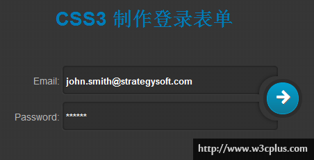
这个案例主要制作的是一个登录表单,在这个案例中使用了box-shadow、gradient,transform和transition等属性,其中最难的地方是输入框被咬的那部分,原本使用纯CSS3的渐变配合多背景制作,但受限于阴影,最终改变使用base的64位图像处理。详细的参考代码吧:
HTML 结构:
<div class="box">
  <form action="#" method="get">
    <ul>
      <li>
        <label for="username">Email:</label><input type="text" id="username"  class="username" placeholder="john.smith@strategysoft.com"/>
      </li>
      <li>
        <label for="password">Password:</label><input type="password" id="password" class="password" placeholder="******"/>
      </li>
     </ul>
     <a href="javascript:;" class="button"/><i class="icon-arrow-right"></i></a>
  </form>
</div>
CSS代码:
body,ul{
	margin: 0;
	padding: 0
}
a {
	color: rgb(1, 124, 185);
	text-decoration: none;
}
input:focus {
	outline: none 0;
}
body{
	color: #b5b5b5;
	font: 14px 'Arial';
}
body,
li:first-child:after,
li:last-child:after{
	background-image: url(data:image/png;base64,...);/**/
}
.box{
	position: relative;
	width: 384px;
	height: 140px;
	margin: 50px auto;
}
.box li{
	list-style-type: none;
	margin-bottom: 10px;
	border-radius: 5px;
	overflow: hidden;
	position: relative;
	height: 42px;
}
.box li input{
	box-shadow:inset 0 0 5px rgba(0,0,0,.5),-1px 1px 0 rgba(255,255,255,.05);
	border:0 none;
	padding:8px 5px 5px;
	border-radius: 5px;
	width:300px;
	height: 28px;
	-webkit-box-sizing: content-box;
	-moz-box-sizing: content-box;
	-o-box-sizing: content-box;
	-ms-box-sizing: content-box;
	box-sizing: content-box;
	background: rgba(0,0,0,.1);
	color: #fff;
}

.box li:first-child:after,
.box li:last-child:after{
	position: absolute;
	width: 50px;
	height: 50px;
	content: "";
	border-radius: 25px;
	z-index: 2;
	right: -23px;
	box-shadow: 0 0 8px rgba(0,0,0,.5);
}
::-webkit-input-placeholder {
	color:#fff;
	font-weight: bold;
}
.box li:first-child:after{
	top: 15px;
}
.box li:last-child:after{
	bottom:15px;
}
.box label{
	width: 70px;
	display: inline-block;
	text-align: right;
}
.box span{
	display: block;
	color: #6296b4;
	padding-left: 75px;
}
.button{
	position: absolute;
	top: 24px;
	right: -30px;
	width: 44px;
	height: 44px;
	border-radius: 22px;
	border:1px solid #00a1d2;
	background: -webkit-linear-gradient(top,#029ecd,#0d7796);
	color: #fff;
	text-shadow:1px 1px 0 #666;
	box-shadow:0 0 0 5px #2c2c2c;
	z-index: 3;
	text-align: center;
	line-height: 46px;
	-webkit-transition: all 0.28s ease-in;
	-moz--transition: all 0.28s ease-in;
}
.button:hover{
	-webkit-transform:rotate(90deg);
}
@font-face {
  font-family: 'FontAwesome';
  src: url('font/fontawesome-webfont.eot');
  src: url('font/fontawesome-webfont.eot?#iefix') format('embedded-opentype'),
			 url('font/fontawesome-webfont.woff') format('woff'),
			 url('font/fontawesome-webfont.ttf') format('truetype'),
			 url('font/fontawesome-webfont.svg#FontAwesome') format('svg');
  font-weight: normal;
  font-style: normal;
}
.icon-arrow-right:before {
  font-family: FontAwesome;
  font-weight: normal;
  font-size: 26px;
  font-style: normal;
  display: inline-block;
  text-decoration: inherit;
  content: "\f061";
}
如需转载,烦请注明出处:http://www.w3cplus.com/demo/css3-login-form.html


