css3动画——垃圾桶
作者:大漠 日期:2012-09-18 点击:403

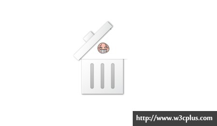
首先非常感谢丸子大师(http://i.wanz.im/)提供这个案例的DEMO源码。这是一个使用CSS3的transform和transition制作的一个动画效果,当鼠标处于悬停状态时,垃圾桶会打开,有一个小卡通被丢进垃圾桶。创意很有意思,实现很简单。如果丸子在花点时间将demo中的图片换成用css3写,就是一个纯CSS3的动画DEMO了,还有一个地方可以改变的,就是不用三个标签,使用CSS3的":before"和":after"来代替里面的子元素。这样就省去两个标签,有兴趣的同学可以尝试一下,在丸子的基础上进行修改,做成后,你会有一种成就感的。
HTML 代码
<div class="trashbin">
  <div class="lid"></div>
  <div class="can"></div>
</div>
CSS 代码
.trashbin {
	width: 128px;
	height: 128px;
	margin: 100px auto;
	-webkit-transition:background-position 0.3s ease-in;
	background: url(http://res.wanz.im/images/smile.gif) center no-repeat;
}
.trashbin .lid{
	background: url(http://res.wanz.im/images/trash.png) 0 0 no-repeat;
	height: 38px;
	-webkit-transition:-webkit-transform 0.3s ease-in;
	-webkit-transform: rotateZ(0) translate(0px, 0px);
}
.trashbin:hover{
	-webkit-transition:background-position 0.3s ease-in;
	background-position: center top;
}
.trashbin:hover .lid{
	-webkit-transition:-webkit-transform 0.3s ease-in;
	-webkit-transform: rotateZ(-45deg) translate(0px, -40px);
}
.trashbin .can{
	background: url(http://res.wanz.im/images/trash.png) 0 -38px no-repeat;
	height: 90px;
}
请使用Webkit内核浏览器浏览,如果您使用的是其他浏览器,请在源码中加上对应的浏览器前缀。
非常感谢丸子为W3cplus提供DEMO。
如需转载,烦请注明出处:http://www.w3cplus.com/demo/create-transhbin-with-css3.html