

css3树形导航
作者:结一 日期:2012-09-10 点击:863

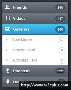
本实例主要是比较好看哈哈,然后使用了css3初级学习者一般不理解的:target这个伪元素,所以收纳。运用的css3有gradient生成渐变背景,:before生成前面的图标及二级菜单的箭头,:target来实现折叠效果,同时还应用了个transition来改变opacity的动画。当然这个案例其实左边的小图标还可以用font-face来制作,那样就更好了。
css主要代码:
.menu {
	width: auto;
	height: auto;
	-webkit-box-shadow: 0px 1px 3px 0px rgba(0,0,0,.73), 0px 0px 18px 0px rgba(0,0,0,.13);
	-moz-box-shadow: 0px 1px 3px 0px rgba(0,0,0,.73), 0px 0px 18px 0px rgba(0,0,0,.13);
	box-shadow: 0px 1px 3px 0px rgba(0,0,0,.73), 0px 0px 18px 0px rgba(0,0,0,.13);
}
.menu > li > a {
	background-color: #616975;
	background-image: -webkit-gradient(linear, left top, left bottom, from(rgb(114, 122, 134)),to(rgb(80, 88, 100)));
	background-image: -webkit-linear-gradient(top, rgb(114, 122, 134), rgb(80, 88, 100));
	background-image: -moz-linear-gradient(top, rgb(114, 122, 134), rgb(80, 88, 100));
	background-image: -o-linear-gradient(top, rgb(114, 122, 134), rgb(80, 88, 100));
	background-image: -ms-linear-gradient(top, rgb(114, 122, 134), rgb(80, 88, 100));
	background-image: linear-gradient(top, rgb(114, 122, 134), rgb(80, 88, 100));
	filter: progid:DXImageTransform.Microsoft.gradient(GradientType=0,StartColorStr='#727a86', EndColorStr='#505864');
	border-bottom: 1px solid #33373d;
	-webkit-box-shadow: inset 0px 1px 0px 0px #878e98;
	-moz-box-shadow: inset 0px 1px 0px 0px #878e98;
	box-shadow: inset 0px 1px 0px 0px #878e98;
	width: 100%;
	height: 2.75em;
	line-height: 2.75em;
	text-indent: 2.75em;
	display: block;
	position: relative;
	font-family: "Helvetica Neue", Helvetica, Arial, sans-serif;
	font-weight: 600;
	color: #fff;
	text-shadow: 0px 1px 0px rgba(0,0,0,.5);
}
.menu ul li a {
	background: #fff;
	border-bottom: 1px solid #efeff0;
	width: 100%;
	height: 2.75em;
	line-height: 2.75em;
	text-indent: 2.75em;
	display: block;
	position: relative;
	font-family: "Helvetica Neue", Helvetica, Arial, sans-serif;
	font-size: 0.923em;
	font-weight: 400;
	color: #878d95;
}
.menu ul li:last-child a {
	border-bottom: 1px solid #33373d;
}
.menu > li > a:hover,
.menu > li > a.active,
.menu > li:target > a  /*add this*/ {
	background-color: #35afe3;
	background-image: -webkit-gradient(linear, left top, left bottom, from(rgb(69, 199, 235)),to(rgb(38, 152, 219)));
	background-image: -webkit-linear-gradient(top, rgb(69, 199, 235), rgb(38, 152, 219));
	background-image: -moz-linear-gradient(top, rgb(69, 199, 235), rgb(38, 152, 219));
	background-image: -o-linear-gradient(top, rgb(69, 199, 235), rgb(38, 152, 219));
	background-image: -ms-linear-gradient(top, rgb(69, 199, 235), rgb(38, 152, 219));
	background-image: linear-gradient(top, rgb(69, 199, 235), rgb(38, 152, 219));
	filter: progid:DXImageTransform.Microsoft.gradient(GradientType=0,StartColorStr='#45c7eb', EndColorStr='#2698db');
	border-bottom: 1px solid #103c56;
	-webkit-box-shadow: inset 0px 1px 0px 0px #6ad2ef;
	-moz-box-shadow: inset 0px 1px 0px 0px #6ad2ef;
	box-shadow: inset 0px 1px 0px 0px #6ad2ef;
}
.menu > li > a.active {
	border-bottom: 1px solid #1a638f;
}
.menu > li > a:before {
	content: '';
	background-image: url(../images/sprite.png);
	background-repeat: no-repeat;
	font-size: 36px;
	height: 1em;
  	width: 1em;
	position: absolute;
  	left: 0;
	top: 50%;
	margin: -.5em 0 0 0;
}
.item1 > a:before {
	background-position: 0 0;
}
.item2 > a:before {
	background-position: -38px 0;
}
.item3 > a:before {
	background-position: 0 -38px;
}
.item4 > a:before {
	background-position: -38px -38px;
}
.item5 > a:before {
	background-position: -76px 0;
}
.menu > li > a span {
	font-size: 0.857em;
	display: inline-block;
	position: absolute;
	right: 1em;
	top: 50%;
	background: #48515c;
	line-height: 1em;
	height: 1em;
	padding: .4em .6em;
	margin: -.8em 0 0 0;
	color: #fff;
	text-indent: 0;
	text-align: center;
	-webkit-border-radius: .769em;
	-moz-border-radius: .769em;
	border-radius: .769em;
	-webkit-box-shadow: inset 0px 1px 3px 0px rgba(0, 0, 0, .26), 0px 1px 0px 0px rgba(255, 255, 255, .15);
	-moz-box-shadow: inset 0px 1px 3px 0px rgba(0, 0, 0, .26), 0px 1px 0px 0px rgba(255, 255, 255, .15);
	box-shadow: inset 0px 1px 3px 0px rgba(0, 0, 0, .26), 0px 1px 0px 0px rgba(255, 255, 255, .15);
	text-shadow: 0px 1px 0px rgba(0,0,0,.5);
	font-weight: 500;
}
.menu > li > a:hover span,
.menu > li a.active span,
.menu > li:target > a span /*add this*/ {
	background: #2173a1;
}
.menu > li > ul li a:before{
	content: '▶';
	font-size: 8px;
	color: #bcbcbf;
	position: absolute;
	width: 1em;
	height: 1em;
	top: 0;
	left: -2.7em;
}

.menu > li > ul li:hover a,
.menu > li > ul li:hover a span,
.menu > li > ul li:hover a:before {
	color: #32373D;
}


.menu ul > li > a span {
	font-size: 0.857em;
	display: inline-block;
	position: absolute;
	right: 1em;
	top: 50%; /
	background: #fff;
	border: 1px solid #d0d0d3;
	line-height: 1em;
	height: 1em;
	padding: .4em .7em;
	margin: -.9em 0 0 0;
	color: #878d95;
	text-indent: 0;
	text-align: center;
	-webkit-border-radius: .769em;
	-moz-border-radius: 769em;
	border-radius: 769em;
	text-shadow: 0px 0px 0px rgba(255,255,255,.01));
}

/*additional*/

.menu > li > ul {
	height: 0;
	overflow: hidden;

	opacity: 0;
  	filter: alpha(opacity=0); /* IE6-IE8 */

	-webkit-transition: opacity 0.9s ease-in-out;
	-moz-transition: opacity 0.9s ease-in-out;
	-o-transition: opacity 0.9s ease-in-out;
	-ms-transition: opacity 0.9s ease-in-out;
	transition: opacity 0.9s ease-in-out;
}

.menu > li:target > ul {
    height: auto; /*using auto nullifies the height transitions, but it makes things flexible which is more important*/
    border-bottom: 1px solid #51555a;

	opacity: 1;
  	filter: alpha(opacity=100); /* IE6-IE8 */
}


