纯css3滚动效果
作者:结一 日期:2012-09-01 点击:5446

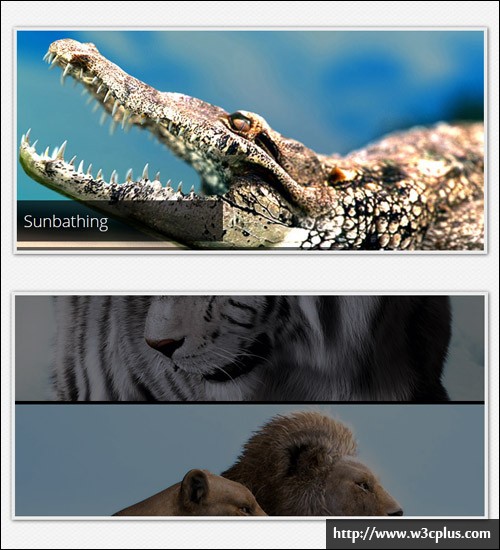
看到该实例标题的时候,表示心情十分激动然后再加上一点忑忑,因为以前看过类似的,但是都比较有缺憾,不那么完美。可是这个媲美从前所有的纯css3打造的滚动效果,可以堪称完美了(除了没有导航控制)。只因制作巧妙精美,所以我只表示欣赏而不好加以评论,感兴趣的话大家还是自己手动研究下为好。
因css3代码篇幅较长,这里只抽出一部分重要的以供参阅:
#slider li.firstanimation {
	-moz-animation:cycle 25s linear infinite;
	-webkit-animation:cycle 25s linear infinite;
}
#slider li.secondanimation {
	-moz-animation:cycletwo 25s linear infinite;
	-webkit-animation:cycletwo 25s linear infinite;
}
@-moz-keyframes cycle {
	0%  { top:0px; }
	4%  { top:0px; }
	16% { top:0px; opacity:1; z-index:0; }
	20% { top:325px; opacity:0; z-index:0; }
	21% { top:-325px; opacity:0; z-index:-1; }
	92% { top:-325px; opacity:0; z-index:0; }
	96% { top:-325px; opacity:0; }
	100%{ top:0px; opacity:1; }

}
@-moz-keyframes cycletwo {
	0%  { top:-325px; opacity:0; }
	16% { top:-325px; opacity:0; }
	20% { top:0px; opacity:1; }
	24% { top:0px; opacity:1; }
	36% { top:0px; opacity:1; z-index:0; }
	40% { top:325px; opacity:0; z-index:0; }
	41% { top:-325px; opacity:0; z-index:-1; }
	100%{ top:-325px; opacity:0; z-index:-1; }
}
...

#slider:hover li,
#slider:hover .progress-bar {
	-moz-animation-play-state:paused;
	-webkit-animation-play-state:paused;
}
...

#slider .tooltip {
	background:rgba(0,0,0,0.7);
	width:300px;
	height:60px;
	position:relative;
	bottom:75px;
	left:-320px;
	-moz-transition:all 0.3s ease-in-out;
	-webkit-transition:all 0.3s ease-in-out;
}
#slider .tooltip h1 {
	color:#fff;
	font-size:24px;
	font-weight:300;
	line-height:60px;
	padding:0 0 0 20px;
}
#slider li#first:hover .tooltip,
#slider li#second:hover .tooltip,
#slider li#third:hover .tooltip,
#slider li#fourth:hover .tooltip,
#slider li#fifth:hover .tooltip {
	left:0px;
}
...

/* PROGRESS BAR */
.progress-bar {
	position:relative;
	top:-5px;
	width:680px;
	height:5px;
	background:#000;
	-moz-animation:fullexpand 25s ease-out infinite;
	-webkit-animation:fullexpand 25s ease-out infinite;
}
@-moz-keyframes fullexpand {
    0%, 20%, 40%, 60%, 80%, 100% { width:0%; opacity:0; }
    4%, 24%, 44%, 64%, 84% { width:0%; opacity:0.3; }
   16%, 36%, 56%, 76%, 96% { width:100%; opacity:0.7; }
   17%, 37%, 57%, 77%, 97% { width:100%; opacity:0.3; }
   18%, 38%, 58%, 78%, 98% { width:100%; opacity:0; }
}
查看更多:http://coding.smashingmagazine.com/2012/04/25/pure-css3-cycling-slideshow/