CSS3 Gradient Buttons
作者:大漠 日期:2011-09-01 点击:1931

前面在《CSS3 Gradient》一文中详细介绍了CSS3中的Gradient属性的使用,一直没来得急介绍这方面的实例,今天在Nick La (@nickla)的Web Designer Wall中看到了一篇《CSS3 Gradient Buttons》主要介绍用CSS3中的Gradient属性制作Buttons的效果。觉得蛮好的,特意整理一份放上来与大家分享。
使用CSS3属性制作渐变按钮,我们只需借助Gradient属性,不需要任何图片,也不需要任何JavaScript,仅仅是纯CSS代码就能制作出靓丽好看的渐变按钮。这些Buttons可以基于字号(font-size)上,具有强大的扩展性,不会在受Buttons的内容限制,另外一点,按钮的大小可以轻松通过padding和font-size来调整。这种方法制作渐变按钮最好的部分是它可以使用html的任何标签,比如说input[type="submit"],div,button,span,a,等等。我们先来看一个效果:
CSS3 Gradient制作buttons的优点
- 纯CSS:没有任何图片和javascript;
- CSS3 Gradient支持现代浏览器(不支持的显示纯色,详情参阅《CSS3 Gradient》);
- 灵活性和扩展性强:可以通为font-size和padding来控制其大小;
- 具有三种状态:正常,hover和active状态;
- 可以使用任何html标签来制作Buttons;
- 可以使用其他CSS3属性增加其他效果,但不支持CSS3属性的浏览器将显示正常化。
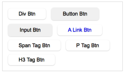
各浏览器下效果
下图显示的是用CSS3的Gradient,border-radius等属性制作的Button在不同浏览器的渲染风格:

按钮三种状态效果
下图展示了按钮三种状态下的效果图:
- 正常状态(Normal State):使用了渐变,圆角,阴影效果;
- 悬浮状态(Hover State):渐变色变深;
- 点击状态(Active State):返转渐变色,向下移1px,以及加深字体色。
其实你还可以加上第四种状态,就是点击后的效果,这里我们以三种为例,请看效果图:

下面开始我们一起来学习如何制作上面展示的buttons。
一般风格(默认风格)
首先我们给Buttons定义一个类名,这样我只需要把要制作Buttons的元素上加上这个类名,前面我们说过,这种方法制作Buttons可以使用任何Html标签,并不会受影响,先来看一个简单的模板:
				<div class="btn">Div Btn</div>
				<button class="btn">Button Btn</button>
				<input type="submit" class="btn" value="Input Btn" />
				<a href="#" class="btn">A Link Btn</a>
				<span class="btn">Span Tag Btn</span>
				<p class="btn">P Tag Btn</p>
				<h3 class="btn">H3 Tag Btn</h3>
从上面的Markup中可以看出,我们给所有需要做成Buttons的元素加上了一个公用的类名“btn”,那么我们需要在这个"Btn"类上,给Buttons制作不同状态的效果:
1、默认状态(Normal State)
				.btn {
					display: inline-block;
					zoom: 1; /* zoom and *display = ie7 hack for display:inline-block */
					*display: inline;
					vertical-align: baseline;
					margin: 0 2px;
					outline: none;
					overflow: visible;/*只有设置这个属性IE下padding才能生效*/
					width: auto;/*现代浏览器下识别*/
					*width:1;/*IE7和IE6识别,设置值为1,我也不知道有何作用,但有些人此处设置值为0*/
					cursor: pointer;
					text-align: center;
					text-decoration: none;
					font: 14px/100% Arial, Helvetica, sans-serif;
					padding: .5em 2em .55em;
					text-shadow: 0 1px 1px rgba(0,0,0,.3);
					-webkit-border-radius: .5em;
					-moz-border-radius: .5em;
					border-radius: .5em;
					border: 0 none;/*去除input,button的默认边框*/
					-webkit-box-shadow: 0 1px 2px rgba(0,0,0,.2);
					-moz-box-shadow: 0 1px 2px rgba(0,0,0,.2);
					box-shadow: 0 1px 2px rgba(0,0,0,.2);
				}
上面的代码使用了em做单位,这样我们可以改变font-size时也能控制buttons的大小,另外还可以通过padding来调整其大小,还有就是,我们在这里使用了box-shadow来制作buttons的阴影,text-shadow制作文字的阴影,以及用border-radius来制作圆角,如果大家不怎么熟悉这几个属性的使用,你可以点击《CSS3 box-shadow》、《CSS3的文字阴影—text-shadow》、《CSS3的圆角Border-radius》了解他们的具体用法。
2、制作悬浮状态(Hover State)
				.btn:hover {
					text-decoration: none;
				}
3、制作点击状态(active State)
				.btn:active {
					position: relative;
					top: 1px;
				}
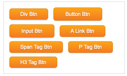
初步效果
此时效果不怎么的样吧,是不是有点失望呀,别急,因为我们还没有加上颜色,为了更好的美化你的Buttons,下面接着看吧。
渐变样式
现在关键的就是给Button加上Gradient效果,我们可以先统一给buttons加上一个一样的渐变色效果:
				.primary {
					color: #fff;
					border: solid 1px #da7c0c;
					background: #f47a20;
					background-repeat: repeat-x;
					background-image: -khtml-gradient(linear, left top, left bottom, from(#faa51a), to(#f47a20));
					background-image: -moz-linear-gradient(#faa51a, #f47a20);
					background-image: -ms-linear-gradient(#faa51a, #f47a20);
					background-image: -webkit-gradient(linear, left top, left bottom, color-stop(0%, #faa51a), color-stop(100%, #f47a20));
					background-image: -webkit-linear-gradient(#faa51a, #f47a20);
					background-image: -o-linear-gradient(#faa51a, #f47a20);
					background-image: linear-gradient(#faa51a, #f47a20);
					filter: progid:DXImageTransform.Microsoft.gradient(GradientType=0, startColorstr=#faa51a, endColorstr=#f47a20);/*IE<9>*/
					-ms-filter: "progid:DXImageTransform.Microsoft.gradient (GradientType=0, startColorstr=#faa51a, endColorstr=#f47a20)";/*IE8+*/
				}
				.primary:hover {
					background: #f06015;
					background-repeat: repeat-x;
					background-image: -khtml-gradient(linear, left top, left bottom, from(#f88e11), to(#f06015));
					background-image: -moz-linear-gradient(#f88e11, #f06015);
					background-image: -ms-linear-gradient(#f88e11, #f06015);
					background-image: -webkit-gradient(linear, left top, left bottom, color-stop(0%, #f88e11), color-stop(100%, #f06015));
					background-image: -webkit-linear-gradient(#f88e11, #f06015);
					background-image: -o-linear-gradient(#f88e11, #f06015);
					background-image: linear-gradient(#f88e11, #f06015);
					filter: progid:DXImageTransform.Microsoft.gradient(GradientType=0, startColorstr=#f88e11, endColorstr=#f06015);/*IE<9>*/
					-ms-filter: "progid:DXImageTransform.Microsoft.gradient (GradientType=0, startColorstr=#f88e11, endColorstr=#f06015)";/*IE8+*/
				}

				.primary:active {
					color: #fcd3a5;
					background: #faa51a;
					background-repeat: repeat-x;
					background-image: -khtml-gradient(linear, left top, left bottom, from(#f47a20), to(#faa51a));
					background-image: -moz-linear-gradient(#f47a20, #faa51a);
					background-image: -ms-linear-gradient(#f47a20, #faa51a);
					background-image: -webkit-gradient(linear, left top, left bottom, color-stop(0%, #f47a20), color-stop(100%, #faa51a));
					background-image: -webkit-linear-gradient(#f47a20, #faa51a);
					background-image: -o-linear-gradient(#f47a20, #faa51a);
					background-image: linear-gradient(#f47a20, #faa51a);
					filter: progid:DXImageTransform.Microsoft.gradient(GradientType=0, startColorstr=#f47a20, endColorstr=#faa51a);/*IE<9>*/
					-ms-filter: "progid:DXImageTransform.Microsoft.gradient (GradientType=0, startColorstr=#f47a20, endColorstr=#faa51a)";/*IE8+*/
				}
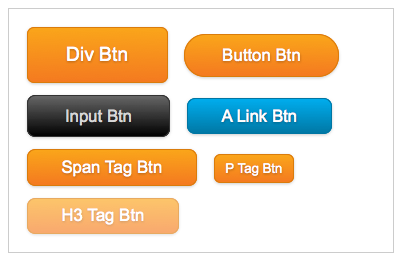
现在样式加好了,但效果并没有显示出来,那是因为我们还有最后一步,把这个类用到你的元素标签上:
				<div class="btn primary">Div Btn</div>
				<button class="btn primary">Button Btn</button>
				<input type="submit" class="btn primary" value="Input Btn" />
				<a href="#" class="btn primary">A Link Btn</a>
				<span class="btn primary">Span Tag Btn</span>
				<p class="btn primary">P Tag Btn</p>
				<h3 class="btn primary">H3 Tag Btn</h3>
这样效果就出来了,如下所示:
如何制作您需要的按钮
上面的方法是制作一个色的按钮,如果你需要制作不同颜色,而且是不同大小的呢?下面这一步就告诉你如何做。
- 首先在原有的.btn .primary样式基础上增加你自己喜欢的颜色,来制作你需要的按钮
- 然后把你需的类追加到你想制作按钮的元素标签上,如:
				<a href="#" class="btn primary blue">A Link Btn</a>
				<input type="submit" class="btn primary black" value="Input Btn" />
接着定.blue,.black样式
				/*blue*/
				.blue {
					color: #fff;
					border: solid 1px #0076a3;
					background: #0078a5;
					background-repeat: repeat-x;
					background-image: -khtml-gradient(linear, left top, left bottom, from(#00adee), to(#0078a5));
					background-image: -moz-linear-gradient(#00adee, #0078a5);
					background-image: -ms-linear-gradient(#00adee, #0078a5);
					background-image: -webkit-gradient(linear, left top, left bottom, color-stop(0%, #00adee), color-stop(100%, #0078a5));
					background-image: -webkit-linear-gradient(#00adee, #0078a5);
					background-image: -o-linear-gradient(#00adee, #0078a5);
					background-image: linear-gradient(#00adee, #0078a5);
					filter: progid:DXImageTransform.Microsoft.gradient(GradientType=0, startColorstr=#00adee, endColorstr=#0078a5);/*IE<9>*/
					-ms-filter: "progid:DXImageTransform.Microsoft.gradient (GradientType=0, startColorstr=#00adee, endColorstr=#0078a5)";/*IE8+*/
				}
				.blue:hover {
					background: #00678e;
					background-repeat: repeat-x;
					background-image: -khtml-gradient(linear, left top, left bottom, from(#0095cc), to(#00678e));
					background-image: -moz-linear-gradient(#0095cc, #00678e);
					background-image: -ms-linear-gradient(#0095cc, #00678e);
					background-image: -webkit-gradient(linear, left top, left bottom, color-stop(0%, #0095cc), color-stop(100%, #00678e));
					background-image: -webkit-linear-gradient(#0095cc, #00678e);
					background-image: -o-linear-gradient(#0095cc, #00678e);
					background-image: linear-gradient(#0095cc, #00678e);
					filter: progid:DXImageTransform.Microsoft.gradient(GradientType=0, startColorstr=#0095cc, endColorstr=#00678e);/*IE<9>*/
					-ms-filter: "progid:DXImageTransform.Microsoft.gradient (GradientType=0, startColorstr=#0095cc, endColorstr=#00678e)";/*IE8+*/
				}

				.blue:active {
					color: #80bed6;
					background: #00adee;
					background-repeat: repeat-x;
					background-image: -khtml-gradient(linear, left top, left bottom, from(#0078a5), to(#00adee));
					background-image: -moz-linear-gradient(#0078a5, #00adee);
					background-image: -ms-linear-gradient(#0078a5, #00adee);
					background-image: -webkit-gradient(linear, left top, left bottom, color-stop(0%, #0078a5), color-stop(100%, #00adee));
					background-image: -webkit-linear-gradient(#0078a5, #00adee);
					background-image: -o-linear-gradient(#0078a5, #00adee);
					background-image: linear-gradient(#0078a5, #00adee);
					filter: progid:DXImageTransform.Microsoft.gradient(GradientType=0, startColorstr=#0078a5, endColorstr=#00adee);/*IE<9>*/
					-ms-filter: "progid:DXImageTransform.Microsoft.gradient (GradientType=0, startColorstr=#0078a5, endColorstr=#00adee)";/*IE8+*/
				}

				/*black*/
				.black {
					color: #d7d7d7;
					border: solid 1px #333;
					background: #000;
					background-repeat: repeat-x;
					background-image: -khtml-gradient(linear, left top, left bottom, from(#666), to(#000));
					background-image: -moz-linear-gradient(#666, #000);
					background-image: -ms-linear-gradient(#666, #000);
					background-image: -webkit-gradient(linear, left top, left bottom, color-stop(0%, #666), color-stop(100%, #000));
					background-image: -webkit-linear-gradient(#666, #000);
					background-image: -o-linear-gradient(#666, #000);
					background-image: linear-gradient(#666, #000);
					filter: progid:DXImageTransform.Microsoft.gradient(GradientType=0, startColorstr=#666, endColorstr=#000);/*IE<9>*/
					-ms-filter: "progid:DXImageTransform.Microsoft.gradient (GradientType=0, startColorstr=#666, endColorstr=#000)";/*IE8+*/
				}
				.black:hover {
					background: #000;
					background-repeat: repeat-x;
					background-image: -khtml-gradient(linear, left top, left bottom, from(#444), to(#000));
					background-image: -moz-linear-gradient(#444, #000);
					background-image: -ms-linear-gradient(#444, #000);
					background-image: -webkit-gradient(linear, left top, left bottom, color-stop(0%, #444), color-stop(100%, #000));
					background-image: -webkit-linear-gradient(#444, #000);
					background-image: -o-linear-gradient(#444, #000);
					background-image: linear-gradient(#444, #000);
					filter: progid:DXImageTransform.Microsoft.gradient(GradientType=0, startColorstr=#444, endColorstr=#000);/*IE<9>*/
					-ms-filter: "progid:DXImageTransform.Microsoft.gradient (GradientType=0, startColorstr=#444, endColorstr=#000)";/*IE8+*/
				}

				.black:active {
					color: #666;
					background: #444;
					background-repeat: repeat-x;
					background-image: -khtml-gradient(linear, left top, left bottom, from(#000), to(#444));
					background-image: -moz-linear-gradient(#000, #444);
					background-image: -ms-linear-gradient(#000, #444);
					background-image: -webkit-gradient(linear, left top, left bottom, color-stop(0%, #000), color-stop(100%, #444));
					background-image: -webkit-linear-gradient(#000, #444);
					background-image: -o-linear-gradient(#000, #444);
					background-image: linear-gradient(#000, #444);
					filter: progid:DXImageTransform.Microsoft.gradient(GradientType=0, startColorstr=#000, endColorstr=#444);/*IE<9>*/
					-ms-filter: "progid:DXImageTransform.Microsoft.gradient (GradientType=0, startColorstr=#000, endColorstr=#444)";/*IE8+*/
				}
我们还可以使用别的类来控制其大小,或者可用与不可用:
				.large {
									font-size: 16px;
									line-height: 28px;
									-webkit-border-radius: 6px;
									-moz-border-radius: 6px;
									border-radius: 6px;
								}
								.small {
									padding-right: 9px;
									padding-left: 9px;
									font-size: 11px;
								}
								.disabled {
									background-image: none;
									filter: alpha(opacity=65);
									-khtml-opacity: 0.65;
									-moz-opacity: 0.65;
									opacity: 0.65;
									cursor: default;
								}
								.btn:disabled {
									background-image: none;
									filter: alpha(opacity=65);
									-khtml-opacity: 0.65;
									-moz-opacity: 0.65;
									opacity: 0.65;
									cursor: default;
									color: #fff;
								}
另外我们还可加上一个基础类,来控制其圆角大小,或者直接写入你的Buttons中
				.bigrounded {
					-webkit-border-radius: 2em;
					-moz-border-radius: 2em;
					border-radius: 2em;
				}
最后我建议给你的buttons加上transition的属性,他会让你的Buttons过渡得更加生动:
			 	.btn {
								-webkit-transition:all 0.5s ease 0.218s;
								-moz-transition: all 0.5s ease 0.218s;
								transition: all 0.5s ease 0.218s;
								}
有关于transitions的具体使用,大家可以点击《CSS3 Transition》,最后我们一起来看看效果:
这种制作buttons效果,也极其类似于BootStrap中介绍的方法,详情点击《CSS——Bootstrap From Twitter》中Buttons部分,当然大家可以根据自己地需求改变大小,并改变适合自己的色系,也可以在上面的基础上制作出,active,focus等效果。如果大家对buttons的制作感兴趣,大家可以去学习一下G爸的按钮样式,绝对是一流的水平。大家也可以点击pixify.com学习google+的按钮制作,要么你直接学习Nick La (@nickla)的《CSS3 Gradient Buttons》,而且Nick La (@nickla)制作了一些实例效果,请看这个DEMO。
如需载转烦请注明出处:W3CPLUS