LESS和CSS3动态制作按钮
作者:大漠 日期:2011-09-02 点击:1125

昨天我在《CSS3 Gradient Buttons》介绍了如何使用CSS3的一些属性(特别是《CSS3 Gradient》)来制作Buttons。然而,制作一个基本的Buttons很简单,无外呼包括以下几步:
- 使用一个渐变属性,制作一个渐变背景,主要使用了CSS3的Gradient属性;详情点击《CSS3 Gradient》
- 给Buttons增加了一些圆角效果,主要使用了CSS3的Border-radius属性;详情点击《CSS3的圆角Border-radius》
- 给Buttons增加了阴影效果,主要使用了CSS3的Text-shadow和Box-shadow属性;详情点击《CSS3的文字阴影—text-shadow》和《CSS3 box-shadow》
- 添加一个细边框
- 重复上面的过程,给Buttons制作悬浮状态和点击状态下效果;
- 为了让Buttons动作效果更生动,还可以在给Buttons加上一个动画效果Transition,详情点击《CSS3 Transition》。
当然要做好Buttons就意味着做好上面的几步,步骤是简单,但是难于写代码呀。考虑到这一点,今天就要和大家一起学习“让我们如何使用CSS抽象的语言,比如说Less(有关于Less更多的介绍,可以点击《CSS——LESS》),使用Less来制作上面的Buttons,将使我们的代码简洁而且超级的灵活。但是首先,让我们简单的了解一下CSS抽象的语言。”
什么是CSS抽象的语言?
什么是CSS抽象的语言?听起来很茫然吧,是的,我也一样,第一次听说这样的概念,那到底什么是CSS抽象语言呢?一个抽象的语言,是一个包装,增加了强大的功能,而且也是以标准的CSS语言为基本。你有没有想过在你的样式表中设置变量或者对你的样式进行运算呢?没有办,那么现在抽象的CSS语言就可以做到这一点。此时你或许会想,如果在样式中做运算发生了错误怎么办?不要急,继续下面的阅读,或许你会像我一样改变当初的想法,并开始会喜欢上这个新东西——抽象的CSS语言。
如何使用CSS抽象的语言?
通常情况下,抽象的CSS语言需要一个后端的语言支持。这个后端语言会解析你的抽象CSS的代码,并在运行时产生正常的,静态的样式表。大家最熟悉的“SASS”,他就需要一个“Ruby”语言支持,“Ruby”会把“SASS”转换成正常的“CSS”样式。这样是不是棒级了,但是有点,对于大多数项目,我们并不需要一个强大的后端框架来支持。换句来说,如果没有后端的语言支持,抽象的CSS语言是不可行的,特别是在小型项目中,除非在大型的,复杂的项目中,你可以使用。这样一来大说会问,那你还扯什么蛋呢?别急,下面我们要说的就是今天的重点的重点了。
Alexis Sellier的Less将打破这种格局,Alexis Sellier写了一个Less.js,让我们不在需要后端的语言来解析抽象的CSS语言,只要使用这个Less就可以实现了。换句话说,不需要什么后端语言,仅仅是大家按下面的步骤来做就能实现不用任何后端语言,只使用一个脚本就能解析抽象的CSS语言:
- 把你的样式表的MIME类型从当初的".css"换成“.less”,如:把你样式文件“style.css”换成“style.less”;
- 文档中引入样式表时,不在使用“rel="stylesheet/css"”而是使用“rel="stylesheet/less"”
- 把less.js脚本文件引入到你文档的head中
- 另外一点需要特别的注意“less”样式文件必须放置在"less.js"的前面。, 这样才会生效。
完成上面几步,你的<head>应该是这样的:
				<link rel="stylesheet/less" href="buttons.less" type="text/css" medial="all" >
				<script src="less.js" type="text/javascript"></script>
这样你就可以正常的使用Less了,比如说在你的buttons.less中设置变量,进行运算呀等等;
				@baseColor: #369;
				@baseHoverColor: darken(@baseColor);

				.btn {
					color: @baseColor;
					&:hover {
						color:@baseHoverColor;
					}
				}
这里展示的只是一小部分关于Less的使用,如果你想更好的运用Less,我建议你可以点击《CSS——LESS》仔细阅读有关于Less的具体使用。
如何使用Less和CSS3制作更好的Buttons?
有时制作一个漂亮的按钮可能会非常棘手,所以我建议大家使用下面的代码,或者点击昨天介绍的《CSS3 Gradient Buttons》如果你想制作出属于自己的Buttons,我建议你借助button making tool来帮助你。下面我们一起来看一段来自《CSS3 Gradient Buttons一文中有关于制作Buttons的代码。
				/*=====默认样式======*/
				.btn {
									display: inline-block;
									zoom: 1; /* zoom and *display = ie7 hack for display:inline-block */
									*display: inline;
									vertical-align: baseline;
									margin: 0 2px;
									outline: none;
									overflow: visible;/*只有设置这个属性IE下padding才能生效*/
									width: auto;/*现代浏览器下识别*/
									*width:1;/*IE7和IE6识别,设置值为1,我也不知道有何作用,但有些人此处设置值为0*/
									cursor: pointer;
									text-align: center;
									text-decoration: none;
									font: 14px/100% Arial, Helvetica, sans-serif;
									padding: .5em 2em .55em;
									text-shadow: 0 1px 1px rgba(0,0,0,.3);
									-webkit-border-radius: .5em;
									-moz-border-radius: .5em;
									border-radius: .5em;
									border: 0 none;/*去除input,button的默认边框*/
									-webkit-box-shadow: 0 1px 2px rgba(0,0,0,.2);
									-moz-box-shadow: 0 1px 2px rgba(0,0,0,.2);
									box-shadow: 0 1px 2px rgba(0,0,0,.2);
								}
						/*=========悬浮状态========*/
						.btn:hover {
											text-decoration: none;
										}
					/*==========点击状态=======*/
					.btn:active {
										position: relative;
										top: 1px;
									}
					/*========给Button加色===========*/
					.primary {
										color: #fff;
										border: solid 1px #da7c0c;
										background: #f47a20;
										background-repeat: repeat-x;
										background-image: -khtml-gradient(linear, left top, left bottom, from(#faa51a), to(#f47a20));
										background-image: -moz-linear-gradient(#faa51a, #f47a20);
										background-image: -ms-linear-gradient(#faa51a, #f47a20);
										background-image: -webkit-gradient(linear, left top, left bottom, color-stop(0%, #faa51a), color-stop(100%, #f47a20));
										background-image: -webkit-linear-gradient(#faa51a, #f47a20);
										background-image: -o-linear-gradient(#faa51a, #f47a20);
										background-image: linear-gradient(#faa51a, #f47a20);
										filter: progid:DXImageTransform.Microsoft.gradient(GradientType=0, startColorstr=#faa51a, endColorstr=#f47a20);/*IE<9>*/
										-ms-filter: "progid:DXImageTransform.Microsoft.gradient (GradientType=0, startColorstr=#faa51a, endColorstr=#f47a20)";/*IE8+*/
									}
									.primary:hover {
										background: #f06015;
										background-repeat: repeat-x;
										background-image: -khtml-gradient(linear, left top, left bottom, from(#f88e11), to(#f06015));
										background-image: -moz-linear-gradient(#f88e11, #f06015);
										background-image: -ms-linear-gradient(#f88e11, #f06015);
										background-image: -webkit-gradient(linear, left top, left bottom, color-stop(0%, #f88e11), color-stop(100%, #f06015));
										background-image: -webkit-linear-gradient(#f88e11, #f06015);
										background-image: -o-linear-gradient(#f88e11, #f06015);
										background-image: linear-gradient(#f88e11, #f06015);
										filter: progid:DXImageTransform.Microsoft.gradient(GradientType=0, startColorstr=#f88e11, endColorstr=#f06015);/*IE<9>*/
										-ms-filter: "progid:DXImageTransform.Microsoft.gradient (GradientType=0, startColorstr=#f88e11, endColorstr=#f06015)";/*IE8+*/
									}

									.primary:active {
										color: #fcd3a5;
										background: #faa51a;
										background-repeat: repeat-x;
										background-image: -khtml-gradient(linear, left top, left bottom, from(#f47a20), to(#faa51a));
										background-image: -moz-linear-gradient(#f47a20, #faa51a);
										background-image: -ms-linear-gradient(#f47a20, #faa51a);
										background-image: -webkit-gradient(linear, left top, left bottom, color-stop(0%, #f47a20), color-stop(100%, #faa51a));
										background-image: -webkit-linear-gradient(#f47a20, #faa51a);
										background-image: -o-linear-gradient(#f47a20, #faa51a);
										background-image: linear-gradient(#f47a20, #faa51a);
										filter: progid:DXImageTransform.Microsoft.gradient(GradientType=0, startColorstr=#f47a20, endColorstr=#faa51a);/*IE<9>*/
										-ms-filter: "progid:DXImageTransform.Microsoft.gradient (GradientType=0, startColorstr=#f47a20, endColorstr=#faa51a)";/*IE8+*/
									}
上面制作出来的按钮如下所示:
上面展示的是CSS3制作Buttons,做出来的是漂亮,但有一点不好的是,如果我们需要制作不同色的Buttons时,我们又要重复上面.primary中的代码,不免烦死人,而且增加代码管理和维护的工作量,那下面我们一起来看看如何使用上在所讲的抽象CSS语言Less来制作类似的Buttons。仔细看上面的代码,制作上图那样的Buttons主要就是包括了:字体色(color),圆角(border-radius),边框颜色(border-color),内边距(padding),字号(font-size),渐变(CSS3 Gradient)等,这几部分我们前面都有介绍过。
现在关键是如何把变量引用到这些值的身上,为了更好的管理你的变量,我建议你把变量都写在样式表的顶部,如下的示:
				@baseColor: #fef4e9;
				@baseHoverColor: #f47c20;
				@backgroundColor: #f78d1d;
				@borderColor: #da7c0c;
				@fontSize: 14px;
现在就是一个不错的开始了,如要我们想改变buttons样式,我们不需要改变所有的CSS样式,我们只需要改变其中的一个,比如说@fontSize。
下面我们来一起来看看如何将上面的CSS样式,转换成相应的变量,首先我们从上面的代码中,我们制作Buttons只要有以下几个参数需要变动:font-size,color,background,padding,border-radius,text-shadow,box-shadow等,接下来我们一起来看如何进行变量化的设置:
1、定义变量
				.border-radius(@radius: 5px) {
				  -moz-border-radius: @radius;
					-webkit--border-radius: @radius;
				  border-radius: @radius;
				}
				/*========Drop shadows===========*/
				.box-shadow(@shadow: 0 1px 3px rgba(0,0,0,.25)) {
				  -webkit-box-shadow: @shadow;
				  -moz-box-shadow: @shadow;
				  box-shadow: @shadow;
				}

				.text-shadow(@shadow:0 1px 1xp rgba(0,0,0,0.25)){
					text-shadow: @shadow;
				}
				/*======== Transitions===========*/
				 .transition(@transition) {
				 	-webkit-transition: @transition;
				 	-moz-transition: @transition;
				 	transition: @transition;
				 }
				/*=========Gradient=============*/
				#gradient {
				   .horizontal(@startColor: #555, @endColor: #333) {
				     background-color: @endColor;
				     background-repeat: no-repeat;
				     background-image: -webkit-gradient(linear, left top, right top, from(@startColor), to(@endColor));
				     background-image: -webkit-linear-gradient(right center, @startColor, @endColor);
				     background-image: -moz-linear-gradient(right center, @startColor, @endColor);
				     background-image: -o-linear-gradient(left,  @startColor,  @endColor);
				     background-image: -khtml-gradient(linear, left top, right top, from(@startColor), to(@endColor));
				     filter: e(%("progid:DXImageTransform.Microsoft.Gradient(StartColorStr='%d', EndColorStr='%d', GradientType=1)",@startColor,@endColor));
				     -ms-filter: %("progid:DXImageTransform.Microsoft.gradient(startColorStr='%d', EndColorStr='%d', GradientType=1))",@startColor,@endColor);
				   }
				   .vertical(@startColor: #555, @endColor: #333) {
				     background-color: @endColor;
				     background-repeat: no-repeat;
				     background-image: -webkit-gradient(linear, left top, left bottom, from(@startColor), to(@endColor));
				     background-image: -webkit-linear-gradient(@startColor, @endColor);
				     background-image: -moz-linear-gradient(@startColor, @endColor);
				     background-image: -o-linear-gradient(top,  @startColor,  @endColor);
				     background-image: -khtml-gradient(linear, left top, left bottom, from(@startColor), to(@endColor));
				     filter: e(%("progid:DXImageTransform.Microsoft.Gradient(StartColorStr='%d', EndColorStr='%d', GradientType=0)",@startColor,@endColor));
				     -ms-filter: %("progid:DXImageTransform.Microsoft.gradient(startColorStr='%d', EndColorStr='%d', GradientType=0))",@startColor,@endColor);
				   }
				   .vertical-three-colors(@startColor: #00b3ee, @midColor: #7a43b6, @colorStop: 0.5, @endColor: #c3325f) {
				     background-color: @endColor;
				     background-repeat: no-repeat;
				     background-image: -webkit-gradient(linear, 0 0, 0 100%, from(@startColor), color-stop(@colorStop, @midColor), to(@endColor));
				     background-image: -webkit-linear-gradient(@startColor, color-stop(@colorStop, @midColor), @endColor);
				     background-image: -moz-linear-gradient(@startColor, color-stop(@midColor, @colorStop), @endColor);
				   }
				 }
上面基本上定义的是CSS3属性的变量,如果你有一个专门为CSS3写的less话,上面的Code直接可以省去了,可以直接下一步:
				/*===========Buttons===========*/
				.button(@color: #f5f5f5, @text_color: #fff, @font_size: 14px, @border-color:#ccc,@padding: .5em 2em .55em,@text_shadow: 0 1px 1px rgba(255,255,255,.75)) {
					 display: inline-block;
					 zoom: 1; /* zoom and *display = ie7 hack for display:inline-block */
					 *display: inline;
					 vertical-align: baseline;
					 margin: 0 2px;
					 outline: none;
					 overflow: visible;/*只有设置这个属性IE下padding才能生效*/
					 width: auto;/*现代浏览器下识别*/
					 *width:1;/*IE7和IE6识别,设置值为1,我也不知道有何作用,但有些人此处设置值为0*/
					 cursor: pointer;
					 text-align: center;
					 text-decoration: none;
					 font-family: Arial, Helvetica, sans-serif;
					 line-height: 100%;
					 font-size:@font_size;
					 padding: @padding;
					 .border-radius(.5em);
					 border: 1px solid @border-color;
					 .box-shadow;
					 .text-shadow(@text_shadow);
					 color: @text_color;
				   #gradient > .vertical(@color,darken(saturate(@color,10),10));
				   @transition: all 0.03s ease-out 0.028s;
					 .transition(@transition);
					&:hover {
						color: @text_color;
						#gradient > .vertical(darken(saturate(@color,10),10),@color);
						text-decoration: none;
					}
					&:active {
						position: relative;
						top: 1px;
					}
				}
上面代码主要是定义了我们的Buttons,接下来我们需要调用他,这个调用是很方便
Html Markup
<a href="#" class="btn">link</a>
Less Code:
				.btn {
					.button(#00ADEE,#D9EEF7,12px,#0076A3,0.5em,0 1px 0 rgba(215,215,215,0.03));
				}
调用非常简单,其中"#00ADEE,#D9EEF7,12px,#0076A3,0.5em,0 1px 0 rgba(215,215,215,0.03)"依次对应的就是“@color”——用于渐变第一个色;“@text_color”——字体色;“@font_size”——字号;“@border-color”——边框色;“@padding”——内边距;“@text_shadow”——文字阴影。当然大家也可以在调用中改变.button的变量,比如说:
				.btn {
					.button(#00ADEE,#D9EEF7,12px,#0076A3,0.5em,0 1px 0 rgba(215,215,215,0.03));
					@box_shadow: inset 0 1px 0 rgba(255,255,255,.2), inset 0 -1px 0 rgba(0,0,0,.2), 0 1px 2px rgba(0,0,0,.25);
					.box-shadow(@box_shadow);
				}
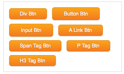
效果:

下面来看其更精彩的部分,我们只要改变变量就能制作出不同的Buttons
Html Code:
				<a href="#" class="btn">Link Button</a>
				<button class="btn orage">Orange Button</button>
				<input type="submit" class="btn green" value="Green Input Button" />
				<span class="btn white small">Withe Span Button</span>
				<div class="btn black larger">Black Div Button</div>
使用起来很方便,来看他们的代码
				.btn {
					.button(#00ADEE,#D9EEF7,12px,#0076A3,0.5em,0 1px 0 rgba(215,215,215,0.03));
					@box_shadow: inset 0 1px 0 rgba(255,255,255,.2), inset 0 -1px 0 rgba(0,0,0,.2), 0 1px 2px rgba(0,0,0,.25);
					.box-shadow(@box_shadow);
					&.orage {
						.button(#FAA51A,#FEF4E9,14px,#DA7C0C,0.25em 0.5em);
						#gradient > .vertical(#FAA51A,#F47A20);
						&:hover {
							#gradient > .vertical(#F47A20,#FAA51A);
						}
					}
					&.green {
					 .button(#7DB72F,#E8F0DE,14px,#538312,0.25em,0 1px 1px rgba(0,0,0,0.25));
						#gradient > .vertical(#7DB72F,#4E7D0E);
						&:hover {
							#gradient > .vertical(#4E7D0E,#7DB72F);
						}
					}
					&.white {
						.button(#FFFFFF,#606060,12px,#B7B7B7);
						#gradient > .vertical(#FFFFFF,#EDEDED);
						&:hover {
							#gradient > .vertical(#EDEDED,#FFFFFF);
						}
					}
					&.black {
						.button(#666666,#D7D7D7,15px,#333333);
						#gradient > .vertical(#666666,#000000);
						&:hover {
							#gradient > .vertical(#000000,#666666);
						}
					}
					&.small{
						font-size: 10px;
						padding: 0.2em;
					}
					&.larger{
						font-size: 18px;
						padding: 0.5em 1em;
					}
				}
效果:

上面的效果有没有让你心动呀,如果心动了的话快点行动吧,大家可以结合昨天的CSS3的《CSS3 Gradient Buttons》和今天的Less-CSS3的对比起来,看看制作相同效果的Buttons,用纯CSS3好呢,还是使用Less结合CSS3好,不浪费大家时间了,感兴趣的动起手来吧。
如需转载烦请注明出处:W3CPLUS