CSS3制作共享工具栏
作者:大漠 日期:2011-12-04 点击:814

今天使用CSS3的伪类“:before”和":after"和animation等相关属性创建一个简单的共享工具提示栏效果。关键的一点是,我使用最少的HTML标签,以及不使用任何jQuery和javaScript脚本。但兼容性就惨了,这个大家都懂的。所以下面的效果只适合Firefox、Safari、Chrome和Opera浏览器。不过这种效果大家在平时制作中肯定常常使用到。那下面我们一起来看如何制作吧。
目标
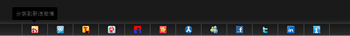
使用纯CSS代码实现下面的DEMO效果:
HTML Markup
制作效果,我们就离不开基本的HTML结构,俗话说的好“巧妇难为无米之炊”,那么我们先写一个HTML结构:
			<footer id="footerBar">
				<ul id="mainPanel">
					<li><a href="#" data-title="分享到新浪微博" class="sina">sina</a></li>
					<li><a href="#" data-title="分享到腾讯微博" class="qq">qq</a></li>
					<li><a href="#" data-title="分享到搜狐微博" class="sohu">sohu</a></li>
					<li><a href="#" data-title="分享到网易微博" class="t163">t163</a></li>
					<li><a href="#" data-title="分享到百度贴吧" class="tieba">tieba</a></li>
					<li><a href="#" data-title="分享到开心网" class="kaixin">kaixin</a></li>
					<li><a href="#" data-title="分享到人人网" class="renren">renren</a></li>
					<li><a href="#" data-title="分享到MSN" class="msn">msn</a></li>
					<li><a href="#" data-title="分享到FaceBook" class="facebook">facebook</a></li>
					<li><a href="#" data-title="分享到Twitter" class="twitter">twitter</a></li>
					<li><a href="#" data-title="分享到Linkedin" class="linkedin">linkedin</a></li>
					<li><a href="#" data-title="一键分享" class="ishare">ishare</a></li>
				</ul>
			</footer>
我在这里使用了一个HTML5的“footer”标签,让他固定浏览器的窗口底部,接着把每一个分享受工具列表项放在一个叫“ul#mainPanel”中,这些都是比较基础的东东,不用过多介绍大家都懂的,但在“<a>”标签中我定义了一个“data-title”,主要配合后面的样式来制作tooltip的内容:
<a href="#" data-title="分享到新浪微博" class="sina">sina</a>
并且在每一个项中定义一个不同的类名,利用sprite技巧制作不同的icon:
<a href="#" data-title="分享到新浪微博" class="sina">sina</a>
CSS Code
上面简单的了解了一下HTML结构,接下来就来看关键的样式制作:
1、固定工具面板
采用“position:fixed”将面板固定在浏览器窗口的底部:
			*{margin: 0;padding:0}
			html {
				height: 100%;
			}
			body {
				background: url(images/pattern_40.gif) repeat left top #161616;
				height: 100%;
				font: 12px/162% Tahoma,Arial,Helvetica,"SimSun","Arial Narrow",Geneva,sans-serif;
			}

			#footerBar {
				background-color:#161616;
				background: -moz-linear-gradient(top, rgba(22,22,22,.7) 0%, rgba(51,51,51,.7) 100%);
				background: -webkit-gradient(linear, left top, left bottom, color-stop(0%,rgba(22,22,22,.7)), color-stop(100%,rgba(51,51,51,.7)));
				background: -webkit-linear-gradient(top, rgba(22,22,22,.7) 0%,rgba(51,51,51,.7) 100%);
				background: -o-linear-gradient(top, rgba(22,22,22,.7) 0%,rgba(51,51,51,.7) 100%);
				background: linear-gradient(top, rgba(22,22,22,.7) 0%,rgba(51,51,51,.7) 100%);
				filter:progid:DXImageTransform.Microsoft.gradient(startColorstr=#B2161616,endColorstr=#B2333333);
				-moz-box-shadow:0 1px 10px rgba(255,255,255,0.3);
				-webkit-box-shadow: 0 1px 10px rgba(255,255,255,0.3);
				box-shadow:0 1px 10px rgba(255,255,255,0.3);
				position:fixed;
				bottom:0;
				left:0;
				z-index:999;
				width:100%;
			}
这里采用了CSS3的渐变和盒阴影来制作其效果,最关键的是采用“position:fixed”固定了面板在窗口底部。由于不用去理会IE6-8的效果,就无需计较IE下的“fixed”处理了。
2、美化列表
现在,我们给我们的无序列表样式,下面仅是一个实例,你可以根据你的喜欢去写一个你想要的列表风格:
			#mainPanel {
				float:left;
				width: 80%;
				margin: 0 10%;
				font-size: 1em;
			}

			#mainPanel li {
				float: left;
				position: relative;
				border-right: 1px solid #555;
				list-style: none outside none;
			}

			#mainPanel li:first-child {
				border-left: 1px solid #555;
			}

			#mainPanel a {
				background: url(images/jiathis_ico.png) no-repeat left top;
				margin:  5px 20px;
				float: left;
				width: 16px;
				height: 16px;
				color: #333;
				position: relative;
				text-decoration: none;
				text-indent: -999em;
			}
3、用icon替换链接文本
接下来,使用sprite技巧将每个链接的文本替换成需要的icon图标:
			#mainPanel a.sina {
				background-position: 0 -96px;
			}
			#mainPanel a.qq {
				background-position: 0 -144px;
			}
			#mainPanel a.sohu {
				background-position: 0 -112px;
			}
			#mainPanel a.t163 {
				background-position: 0 -128px;
			}
			#mainPanel a.tieba {
				background-position: 0 -512px;
			}
			#mainPanel a.kaixin {
				background-position: 0 -176px;
			}
			#mainPanel a.renren {
				background-position: 0 -160px;
			}
			#mainPanel a.msn {
				background-position: 0 -1424px;
			}
			#mainPanel a.facebook {
				background-position: 0 -688px;
			}
			#mainPanel a.twitter {
				background-position: 0 -704px;
			}
			#mainPanel a.linkedin {
				background-position: 0 -1152px;
			}
			#mainPanel a.ishare {
				background-position: 0 -1857px;
			}
4、制作tooltip效果
制作tooltip效果,方法很多,就是使用纯CSS也能实现,我们在前面在《八个制作Linking(链接)的技巧》中有简单的介绍一种制作方法。但今天我想给大家介绍的是另外一种方法,使用“a:hover:before”和“a:hover:after”技巧:
			#mainPanel a:hover:before {
				content:attr(data-title);
				background-color: #000;
				text-align: center;
				text-indent: 0;
				width: 90px;
				padding: 5px;
				broder: 1px solid #111;
				border-color: #111 #333 #333 #111;
				-moz-border-radius: 3px;
				-webkit-border-radius: 3px;
				border-radius: 3px;
				color: #666;
				font-size: 1em;
				position: absolute;
				top: 0px;
				left: 50%;
				margin: -43px -50px;
				z-index: 9999;
			}
			#mainPanel a:hover:after {
				border: 7px solid #111;
				border-color: #000 transparent transparent;
				position: absolute;
				top: 20px;
				content:"";
				display: block;
				width: 0;
				height: 0;
				left:0;
				top: -15px;
				z-index: 9999;
			}
上面代码,我有必要说明两点,首先此处我们使用:
			#mainPanel a:hover:before {
				content:attr(data-title);
			}
上面的一种特殊方法,将调用了我们前面在“a”链接中定义的“data-title”属性值,从而生成了tooltip中的文本内容。我想这种方法还是蛮少人使用的,大家不仿尝试一下。
另外一点采用“a:hover:after”来制作了一个向下的小三角开形:
			#mainPanel a:hover:after {
				border: 7px solid #111;
				border-color: #000 transparent transparent;
				position: absolute;
				top: 20px;
				content:"";
				display: block;
				width: 0;
				height: 0;
				left:0;
				top: -15px;
				z-index: 9999;
			}
这个三角主要使用border属性实现,详细的制作大家可以参阅《纯CSS制作的图形效果》。
到此时,我们tooltip的效果就出来了,或许有童鞋会问,为什么要在“a:hover”下加“:after”和“:before”,其实很简单的道理,因为我们只想在链接的悬浮状态下显示tooltip的内容。
5、动态效果
其实这个时候,我们的效果已经出来了。为了让其tooltip显示没有那么生硬,我在这里加上了一点动画效果:
			#mainPanel a:hover:before {
				content:attr(data-title);
				background-color: #000;
				text-align: center;
				text-indent: 0;
				width: 90px;
				padding: 5px;
				broder: 1px solid #111;
				border-color: #111 #333 #333 #111;
				-moz-border-radius: 3px;
				-webkit-border-radius: 3px;
				border-radius: 3px;
				color: #666;
				font-size: 1em;
				position: absolute;
				top: 0px;
				left: 50%;
				margin: -43px -50px;
				z-index: 9999;
				-moz-animation:mymove .25s linear;
				-webkit-animation:mymove .25s linear;
				-o-animation:mymove .25s linear;
				-ms-animation:mymove .25s linear;
				animation:mymove .25s linear;
			}
			#mainPanel a:hover:after {
				border: 7px solid #111;
				border-color: #000 transparent transparent;
				position: absolute;
				top: 20px;
				content:"";
				display: block;
				width: 0;
				height: 0;
				left:0;
				top: -15px;
				z-index: 9999;
				-moz-animation:mymove .25s linear;
				-webkit-animation:mymove .25s linear;
				-o-animation:mymove .25s linear;
				-ms-animation:mymove .25s linear;
				animation:mymove .25s linear;
			}

			@-moz-keyframes mymove {
				0%{ -moz-transform:scale(0,0); opacity:0;}
				50%{ -moz-transform:scale(1.2,1.2); opacity:0.3; }
				75%{ -moz-transform:scale(0.9,0.9); opacity:0.7;}
				100%{ -moz-transform:scale(1,1); opacity:1;}
			}

			@-webkit-keyframes mymove {
				0%{ -webkit-transform:scale(0,0); opacity:0;}
				50%{ -webkit-transform:scale(1.2,1.2); opacity:0.3;}
				75%{ -webkit-transform:scale(0.9,0.9); opacity:0.7;}
				100%{ -webkit-transform:scale(1,1); opacity:1;}
			}
这里我使用Animation来制作动画。通过“keyframe”自己定义了一个“mymove”的动画效果,在这个效果中主要改变了“transform”和“opacity”:
			@-moz-keyframes mymove {
				0%{ -moz-transform:scale(0,0); opacity:0;}
				50%{ -moz-transform:scale(1.2,1.2); opacity:0.3; }
				75%{ -moz-transform:scale(0.9,0.9); opacity:0.7;}
				100%{ -moz-transform:scale(1,1); opacity:1;}
			}

			@-webkit-keyframes mymove {
				0%{ -webkit-transform:scale(0,0); opacity:0;}
				50%{ -webkit-transform:scale(1.2,1.2); opacity:0.3;}
				75%{ -webkit-transform:scale(0.9,0.9); opacity:0.7;}
				100%{ -webkit-transform:scale(1,1); opacity:1;}
			}
有关于这个动画效果的制作,大家可以参阅css3中的Animation和transform两个属性的使用。当然大家还可以使用别的动画效果,比如:Animate.css中介绍的动画效果。
那么现在效果就算完成了,大家可以参考最后使用的CSS代码:
			*{margin: 0;padding:0}
			html {
				height: 100%;
			}
			body {
				background: url(images/pattern_40.gif) repeat left top #161616;
				height: 100%;
				font: 12px/162% Tahoma,Arial,Helvetica,"SimSun","Arial Narrow",Geneva,sans-serif;
			}

			#footerBar {
				background-color:#161616;
				background: -moz-linear-gradient(top, rgba(22,22,22,.7) 0%, rgba(51,51,51,.7) 100%);
				background: -webkit-gradient(linear, left top, left bottom, color-stop(0%,rgba(22,22,22,.7)), color-stop(100%,rgba(51,51,51,.7)));
				background: -webkit-linear-gradient(top, rgba(22,22,22,.7) 0%,rgba(51,51,51,.7) 100%);
				background: -o-linear-gradient(top, rgba(22,22,22,.7) 0%,rgba(51,51,51,.7) 100%);
				background: linear-gradient(top, rgba(22,22,22,.7) 0%,rgba(51,51,51,.7) 100%);
				filter:progid:DXImageTransform.Microsoft.gradient(startColorstr=#B2161616,endColorstr=#B2333333);
				-moz-box-shadow:0 1px 10px rgba(255,255,255,0.3);
				-webkit-box-shadow: 0 1px 10px rgba(255,255,255,0.3);
				box-shadow:0 1px 10px rgba(255,255,255,0.3);
				position:fixed;
				bottom:0;
				left:0;
				z-index:999;
				width:100%;
			}
			#mainPanel {
				float:left;
				width: 80%;
				margin: 0 10%;
				font-size: 1em;
			}

			#mainPanel li {
				float: left;
				position: relative;
				border-right: 1px solid #555;
				list-style: none outside none;
			}

			#mainPanel li:first-child {
				border-left: 1px solid #555;
			}

			#mainPanel a {
				background: url(images/jiathis_ico.png) no-repeat left top;
				margin:  5px 20px;
				float: left;
				width: 16px;
				height: 16px;
				color: #333;
				position: relative;
				text-decoration: none;
				text-indent: -999em;
				outline: 0;
			}
			#mainPanel a.sina {
				background-position: 0 -96px;
			}
			#mainPanel a.qq {
				background-position: 0 -144px;
			}
			#mainPanel a.sohu {
				background-position: 0 -112px;
			}
			#mainPanel a.t163 {
				background-position: 0 -128px;
			}
			#mainPanel a.tieba {
				background-position: 0 -512px;
			}
			#mainPanel a.kaixin {
				background-position: 0 -176px;
			}
			#mainPanel a.renren {
				background-position: 0 -160px;
			}
			#mainPanel a.msn {
				background-position: 0 -1424px;
			}
			#mainPanel a.facebook {
				background-position: 0 -688px;
			}
			#mainPanel a.twitter {
				background-position: 0 -704px;
			}
			#mainPanel a.linkedin {
				background-position: 0 -1152px;
			}
			#mainPanel a.ishare {
				background-position: 0 -1857px;
			}

			#mainPanel a:hover:before {
				content:attr(data-title);
				background-color: #000;
				text-align: center;
				text-indent: 0;
				width: 90px;
				padding: 5px;
				broder: 1px solid #111;
				border-color: #111 #333 #333 #111;
				-moz-border-radius: 3px;
				-webkit-border-radius: 3px;
				border-radius: 3px;
				color: #666;
				font-size: 1em;
				position: absolute;
				top: 0px;
				left: 50%;
				margin: -43px -50px;
				z-index: 9999;
				-moz-animation:mymove .25s linear;
				-webkit-animation:mymove .25s linear;
				-o-animation:mymove .25s linear;
				-ms-animation:mymove .25s linear;
				animation:mymove .25s linear;
			}
			#mainPanel a:hover:after {
				border: 7px solid #111;
				border-color: #000 transparent transparent;
				position: absolute;
				top: 20px;
				content:"";
				display: block;
				width: 0;
				height: 0;
				left:0;
				top: -15px;
				z-index: 9999;
				-moz-animation:mymove .25s linear;
				-webkit-animation:mymove .25s linear;
				-o-animation:mymove .25s linear;
				-ms-animation:mymove .25s linear;
				animation:mymove .25s linear;
			}

			@-moz-keyframes mymove {
				0%{ -moz-transform:scale(0,0); opacity:0;}
				50%{ -moz-transform:scale(1.2,1.2); opacity:0.3; }
				75%{ -moz-transform:scale(0.9,0.9); opacity:0.7;}
				100%{ -moz-transform:scale(1,1); opacity:1;}
			}

			@-webkit-keyframes mymove {
				0%{ -webkit-transform:scale(0,0); opacity:0;}
				50%{ -webkit-transform:scale(1.2,1.2); opacity:0.3;}
				75%{ -webkit-transform:scale(0.9,0.9); opacity:0.7;}
				100%{ -webkit-transform:scale(1,1); opacity:1;}
			}
最终效果如下所示:
到此这篇教程就介绍完了。我在此使用的是纯CSS3技巧制作的一个固定分享栏效果,而且里面的tooltip效果没有使用任何的脚本,为了能看到效果,建议大家在Firefox、Chrome、Safari和opera浏览器下浏览。如果您有任何意见或建议,请随时在下面的评论中留言。
如需转载烦请注明出处:W3CPLUS