

CSS3和jQuery制作Login栏
作者:大漠 日期:2012-03-20 点击:1180

这两天制作了一个登入栏效果的案例,简单点说就是集成了以前本站介绍的几个效果。

另个在这个案例增加了两部分新东西:
BootStrap的基本样式和Tooltip效果
CSS3的制作的下拉与收缩的panel效果
自我感觉效果还可以,兼容所有现代浏览器,于是整理了一下,放上来与大家分享。
HTML Markup
		<input type="checkbox" role="button" id="topBar"/>
		<label for="topBar" onclick="">
		  <span>Login | Signup</span>
		  <span>Login | Signup</span>
		</label>
		<aside id="loginWrap" class="loginBar" role="loginBar">
		  <section class="container">
		    <div id="formContainer">
		      <form action="./" method="post" id="login" class="form-horizontal">
		        <h1>Log In</h1>
		        <fieldset class="input-text">
		          <legend>LogIn</legend>
		          <div class="control-group">
		            <input type="text" required="" autofocus="" placeholder="Enter your name" id="login-username" class="span4">
		            <input type="password" required="" placeholder="Enter your password" id="login-password" class="span4">
		          </div>
		        </fieldset>
		        <fieldset class="input-actions">
		          <legend>Login Actions</legend>
		          <div class="form-actions">
		            <input type="submit" value="Log in" id="signup-submit" class="btn signupBtn">
		            <a href="#">Forgot your password?</a><a id="flipToSignup" class="flipLink" data-original-title="Click here, Flip To Sign Up" rel="tooltip">Sign up</a>
		          </div>
		        </fieldset>
		      </form>
		      <!-- End Login from -->
		      <form action="./" method="post" id="signup" class="form-horizontal">
		        <h1>Sign Up</h1>
		        <fieldset class="input-text">
		          <legend>Sign up</legend>
		          <div class="control-group">
		            <input type="text" required="" autofocus="" placeholder="Enter your name" id="signup-username" class="span4">
		            <input type="text" required="" autofocus="" placeholder="Enter your E-mail" id="signup-email" class="span4">
		            <input type="password" required="" placeholder="Enter your password" id="signup-password" class="span4">
		          </div>
		        </fieldset>
		        <fieldset class="input-actions">
		          <legend>Sign up Actions</legend>
		          <div class="form-actions">
		            <input type="submit" value="Sign up" id="login-submit" class="btn loginBtn">
		            <a id="flipToLogin" rel="tooltip" class="flipLink" data-original-title="Click here, Flip To Log In">Log In</a>
		            <label class="checkbox">
		              <input type="checkbox" disabled="" value="option1" id="optionsCheckbox2">
		              I agree to the w3cplus service
		            </label>
		          </div>
		        </fieldset>
		      </form>
		    </div>
		  </section>
		</aside>
上面的结构大家都清楚,但有几个地方需要特别提出,因为这几个地方对我们实现效果有关键性的作用。
1、CSS3制作panel的效果
先来说一下CSS3制作panel效果,就是点击“label”后会选择中“input[type="checkbox"]”,从而触发整个“aside.loginBar”显示或隐藏的效果。那么这里三个标签有顺序问题:
		<input type="checkbox" role="button" id="topBar"/>
		<label for="topBar" onclick=""></label>
		<aside id="loginWrap" class="loginBar" role="loginBar"></aside>
这三个标签一定不能随意调换先后顺序,不然后面的效果我们就无法实现。
2、旋转表单效果
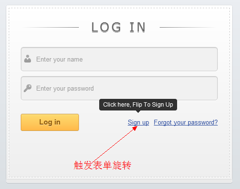
旋转表单的效果,这里有两点需要注意,其一将两个表单并列放在容器“div#formContainer”中,而且每个表单我们需要一个触发旋转的锚点
在login表单中放一个触发到signup表单的锚点
<a id="flipToSignup" class="flipLink" data-original-title="Click here, Flip To Sign Up" rel="tooltip">Sign up</a>
而在signup表单中同样需要放置一个触发到login表单的锚点
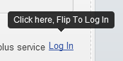
<a id="flipToLogin" rel="tooltip" class="flipLink" data-original-title="Click here, Flip To Log In">Log In</a>
3、tooltip提示效果
这个案例中,在触发表单旋转的两个锚点处使用了BootStrap的tooltip效果,那么使用这个效果,我们同样需要满足其结构和属性值设置的需求:
		<a id="flipToSignup" class="flipLink" data-original-title="Click here, Flip To Sign Up" rel="tooltip">Sign up</a>
		<a id="flipToLogin" class="flipLink" data-original-title="Click here, Flip To Log In" rel="tooltip" >Log In</a>
4、表单的结构
其实表单的结构没有什么好说的,大家可以根据自己的习惯去书写,不过这里为了尝试BootStrap的“form”效果,我还是按照BootStrap的“form”写的,具体的大家可以参考上面的代码。
理清了HTML后,我们就可以开始后面的工作了,就是写CSS效果。
CSS Code
样式我这里也分几个步骤来说:
1、BootStrap样式调用
在这个案例中采用了BootStrap的样式,大家喜欢的话可以到这里下载,然后取得相应的“bootstrap.css”,调用到你的项目之中:
<link rel="stylesheet" href="css/bootstrap.css" />
这样就具有了BootStrap前端框架的样式。
2、表单的样式
其实调用了BootStrap样式后,对于表单来说就有一个完美的效果了,只不过你的结构和类名需要和BootStrap的Forms一致。不过此处我还在Bootstrap的表单上做了一些修改:
/*formContainer*/
#formContainer {
	margin: 20px auto;
}
#formContainer form {
	background-color: #fff;
	background-image: -webkit-gradient(linear, left top, left bottom, from(#fff), to(#eee));
	background-image: -webkit-linear-gradient(top, #fff, #eee);
	background-image: -moz-linear-gradient(top, #fff, #eee);
	background-image: -ms-linear-gradient(top, #fff, #eee);
	background-image: -o-linear-gradient(top, #fff, #eee);
	background-image: linear-gradient(top, #fff, #eee);
	filter: progid:DXImageTransform.Microsoft.gradient(GradientType=0, startColorstr=#fff, endColorstr=#eee);
	-ms-filter: "progid:DXImageTransform.Microsoft.gradient (GradientType=0, startColorstr=#fff, endColorstr=#eee)";
	height: 300px;
	width: 407px;
	padding: 30px;
	border-radius: 3px;
	box-shadow:0 0 2px rgba(0, 0, 0, 0.2),0 1px 1px rgba(0, 0, 0, .2),0 3px 0 #fff,0 4px 0 rgba(0, 0, 0, .2),0 6px 0 #fff,0 7px 0 rgba(0, 0, 0, .2);
	position: relative;
}
#formContainer form::before {
	content: '';
	position: absolute;
	z-index: 1;
	border: 1px dashed #ccc;
	top: 5px;
	bottom: 5px;
	left: 5px;
	right: 5px;
	box-shadow: 0 0 0 1px #fff;
}
#formContainer form h1{
	text-shadow: 0 1px 0 rgba(255, 255, 255, .7), 0px 2px 0 rgba(0, 0, 0, .5);
	text-transform: uppercase;
	text-align: center;
	color: #666;
	margin: 0 0 30px 0;
	letter-spacing: 4px;
	font: normal 26px/1 Verdana, Helvetica;
	position: relative;
}
#formContainer form h1::after,
#formContainer form h1::before	{
	background-color: #777;
	content: "";
	height: 1px;
	position: absolute;
	top: 15px;
	width: 120px;
}
#formContainer form h1::after{
	background-image: -webkit-gradient(linear, left top, right top, from(#777), to(#fff));
	background-image: -webkit-linear-gradient(left, #777, #fff);
	background-image: -moz-linear-gradient(left, #777, #fff);
	background-image: -ms-linear-gradient(left, #777, #fff);
	background-image: -o-linear-gradient(left, #777, #fff);
	background-image: linear-gradient(left, #777, #fff);
	filter: progid:DXImageTransform.Microsoft.gradient(GradientType=0, startColorstr=#777, endColorstr=#fff);
	-ms-filter: "progid:DXImageTransform.Microsoft.gradient (GradientType=0, startColorstr=#777, endColorstr=#fff)";
	right: 0;
}
#formContainer form h1::before	{
	background-image: -webkit-gradient(linear, right top, left top, from(#777), to(#fff));
	background-image: -webkit-linear-gradient(right, #777, #fff);
	background-image: -moz-linear-gradient(right, #777, #fff);
	background-image: -ms-linear-gradient(right, #777, #fff);
	background-image: -o-linear-gradient(right, #777, #fff);
	background-image: linear-gradient(right, #777, #fff);
	filter: progid:DXImageTransform.Microsoft.gradient(GradientType=0, startColorstr=#777, endColorstr=#fff);
	-ms-filter: "progid:DXImageTransform.Microsoft.gradient (GradientType=0, startColorstr=#777, endColorstr=#fff)";
	left: 0;
}
#formContainer form fieldset	{
	border: 0;
	padding: 0;
	margin: 0;
	position: relative;
	z-index:3;
}
#formContainer form legend {
	display: none;
}
#formContainer form .control-group {
	margin-top: 0;
}
.input-text  input{
	background: #f1f1f1 url(../image/login-sprite.png) no-repeat;
	padding: 15px 15px 15px 30px;
	margin: 0 0 10px 0;
	border: 1px solid #ccc;
	border-radius: 5px;
	box-shadow: 0 1px 1px #ccc inset, 0 1px 0 #fff;
}
#login-username,
#signup-username	{
	background-position: 5px 15px !important;
}
#login-password,
#signup-password	{
	background-position: 5px -34px !important;
}
#signup-email {
	background-position: 7px -82px !important;
}
.input-text  input:focus	{
	background-color: #fff;
	border-color: #e8c291;
	outline: none;
	box-shadow: 0 0 0 1px #e8c291 inset;
}
.input-actions	.form-actions{
	margin: 0;
	padding: 0;
	background: none;
	border: none;
}
.input-actions .btn	{
	background-color: #ffb94b;
	background-image: -webkit-gradient(linear, left top, left bottom, from(#fddb6f), to(#ffb94b));
	background-image: -webkit-linear-gradient(top, #fddb6f, #ffb94b);
	background-image: -moz-linear-gradient(top, #fddb6f, #ffb94b);
	background-image: -ms-linear-gradient(top, #fddb6f, #ffb94b);
	background-image: -o-linear-gradient(top, #fddb6f, #ffb94b);
	background-image: linear-gradient(top, #fddb6f, #ffb94b);
	filter: progid:DXImageTransform.Microsoft.gradient(GradientType=0, startColorstr=#fddb6f, endColorstr=#ffb94b);
	-ms-filter: "progid:DXImageTransform.Microsoft.gradient (GradientType=0, startColorstr=#fddb6f, endColorstr=#ffb94b)";
	-moz-border-radius: 3px;
	-webkit-border-radius: 3px;
	border-radius: 3px;
	text-shadow: 0 1px 0 rgba(255,255,255,0.5);
	box-shadow: 0 0 1px rgba(0, 0, 0, 0.3), 0 1px 0 rgba(255, 255, 255, 0.3) inset;
	border-width: 1px;
	border-style: solid;
	border-color: #d69e31 #e3a037 #d5982d #e3a037;
	float: left;
	height: 35px;
	padding: 0;
	width: 120px;
	cursor: pointer;
	font: bold 15px Arial, Helvetica;
	color: #8f5a0a;
}
.input-actions .btnt:hover,
.input-actions .btn:focus		{
	background-color: #fddb6f;
	background-image: -webkit-gradient(linear, left top, left bottom, from(#ffb94b), to(#fddb6f));
	background-image: -webkit-linear-gradient(top, #ffb94b, #fddb6f);
	background-image: -moz-linear-gradient(top, #ffb94b, #fddb6f);
	background-image: -ms-linear-gradient(top, #ffb94b, #fddb6f);
	background-image: -o-linear-gradient(top, #ffb94b, #fddb6f);
	background-image: linear-gradient(top, #ffb94b, #fddb6f);
	filter: progid:DXImageTransform.Microsoft.gradient(GradientType=0, startColorstr=#ffb94b, endColorstr=#fddb6f);
	-ms-filter: "progid:DXImageTransform.Microsoft.gradient (GradientType=0, startColorstr=#ffb94b, endColorstr=#fddb6f)";
}
.input-actions .btn:active {
	outline: none;
	box-shadow: 0 1px 4px rgba(0, 0, 0, 0.5) inset;
}
.input-actions	.form-actions a	{
	color: #3151A2;
	float: right;
	line-height: 35px;
	margin-left: 10px;
	text-decoration: underline;
}
.input-actions .checkbox {
	float: right;
	margin-top: 10px;
}
效果
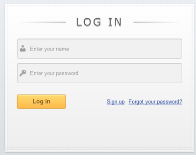

表单的制作效果,详情大家还可以参考《CSS3制作Login栏》一文。
2、翻转表单样式
这个样式也是相当的关键,使用CSS3写的一个3D旋转效果
	/*formContainer*/
#formContainer {
	width: 467px;
	margin: 20px auto;

	height: 381px;
	position: relative;
	-moz-perspective: 800px;
	-webkit-perspective: 800px;
	perspective: 800px;

}
#formContainer form {
	background-color: #fff;
	background-image: -webkit-gradient(linear, left top, left bottom, from(#fff), to(#eee));
	background-image: -webkit-linear-gradient(top, #fff, #eee);
	background-image: -moz-linear-gradient(top, #fff, #eee);
	background-image: -ms-linear-gradient(top, #fff, #eee);
	background-image: -o-linear-gradient(top, #fff, #eee);
	background-image: linear-gradient(top, #fff, #eee);
	filter: progid:DXImageTransform.Microsoft.gradient(GradientType=0, startColorstr=#fff, endColorstr=#eee);
	-ms-filter: "progid:DXImageTransform.Microsoft.gradient (GradientType=0, startColorstr=#fff, endColorstr=#eee)";
	height: 300px;
	width: 407px;
	padding: 30px;
	border-radius: 3px;
	box-shadow:0 0 2px rgba(0, 0, 0, 0.2),0 1px 1px rgba(0, 0, 0, .2),0 3px 0 #fff,0 4px 0 rgba(0, 0, 0, .2),0 6px 0 #fff,0 7px 0 rgba(0, 0, 0, .2);

	position: absolute;
	top: 0;
	left: 0;
	z-index: 2;
	/*enabling 3d space for the transforms*/
	-moz-transform-style: preserve-3d;
	-webkit-transform-style: preserve-3d;
	transform-style: preserve-3d;
	/*when the forms are flipped, they will be hidden*/
	-moz-backface-visibility: hidden;
	-webkit-backface-visibility: hidden;
	backface-visibility: hidden;
	-moz-transition: 0.8s;
	-webkit-transition: 0.8s;
	transition: 0.8s;

}
#login {
	z-index: 100;
}
#signup {
	z-index: 2;
	opacity: 0;
	/*rotating the recover password form by default*/
	-moz-transform:rotateY(180deg);
	-webkit-transform:rotateY(180deg);
	transform:rotateY(180deg);
}
#formContainer.flipped #login {
	opacity:0;
	/*rotating the login form when the flipped class is added to the container*/
	-moz-transform: rotateY(-180deg);
	-webkit-transform: rotateY(-180deg);
	transform: rotateY(-180deg);
}
#formContainer.flipped #signup {
	opacity:1;
	/*rotating the recover div into view*/
	-moz-transform: rotateY(0deg);
	-webkit-transform: rotateY(0deg);
	transform: rotateY(0deg);
}
上面的效果前段时间在《CSS3和JQuery制作翻转表单》有做过详细的介绍,感兴趣的同学可以去看看。
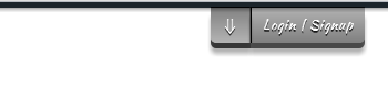
3、loginBar按钮的制作
接下来是制作loginBar的按钮效果
[for="topBar"] span {
	-moz-transition: all 0.125s linear 0s;
	-webkit-transition: all 0.125s linear 0s;
	-o-transition: all 0.125s linear 0s;
	-ms-transition: all 0.125s linear 0s;
	transition: all 0.125s linear 0s;
	color: #FFFFFF;
  font: 12px 'Kaushan Script',cursive;
  letter-spacing: 1px;
  text-shadow: 0 1px 0 rgba(0, 0, 0, 0.6), 0 2px 0 rgba(0, 0, 0, 0.6);
}

[for="topBar"] span:nth-of-type(1),
#topBar:checked ~ [for="topBar"] span:nth-of-type(2) {
  padding:8px 10px;
	border: none;
	border-left:solid 1px rgba(0, 0, 0, 08);
	background: -moz-linear-gradient(top, rgba(0, 0, 0, 0.3) 0%, rgba(0, 0, 0, 0.5) 100%); /* FF3.6+ */
	background: -webkit-gradient(linear, left top, left bottom, color-stop(0%,rgba(0, 0, 0, 0.3)), color-stop(100%,rgba(0, 0, 0, 0.5))); /* Chrome,Safari4+ */
	background: -webkit-linear-gradient(top, rgba(0, 0, 0, 0.3) 0%,rgba(0, 0, 0, 0.5) 100%); /* Chrome10+,Safari5.1+ */
	background: -o-linear-gradient(top, rgba(0, 0, 0, 0.3) 0%,rgba(0, 0, 0, 0.5) 100%); /* Opera 11.10+ */
	background: -ms-linear-gradient(top, rgba(0, 0, 0, 0.3) 0%,rgba(0, 0, 0, 0.5) 100%); /* IE10+ */
	background: linear-gradient(top, rgba(0, 0, 0, 0.3) 0%,rgba(0, 0, 0, 0.5) 100%); /* W3C */
	border-radius: 0 0 5px 0;
	box-shadow: 0 1px 0 rgba(0, 0, 0, 0.8) inset, 0 5px 0 0 rgba(0, 0, 0, 0.6), 0 10px 5px rgba(0, 0, 0, 0.3);
}
[for="topBar"] span:nth-of-type(1):active ,
#topBar:checked ~ [for="topBar"] span:nth-of-type(2):active{
	top:3px;
	border-left-color:rgba(0,0,0,0.33);
	background: -moz-linear-gradient(top, rgba(0, 0, 0, 0.13) 0%, rgba(0, 0, 0, 0.3) 100%); /* FF3.6+ */
	background: -webkit-gradient(linear, left top, left bottom, color-stop(0%,rgba(0, 0, 0, 0.13)), color-stop(100%,rgba(0, 0, 0, 0.3))); /* Chrome,Safari4+ */
	background: -webkit-linear-gradient(top, rgba(0, 0, 0, 0.13) 0%,rgba(0, 0, 0, 0.3) 100%); /* Chrome10+,Safari5.1+ */
	background: -o-linear-gradient(top, rgba(0, 0, 0, 0.13) 0%,rgba(0, 0, 0, 0.3) 100%); /* Opera 11.10+ */
	background: -ms-linear-gradient(top, rgba(0, 0, 0, 0.13) 0%,rgba(0, 0, 0, 0.3) 100%); /* IE10+ */
	background: linear-gradient(top, rgba(0, 0, 0, 0.13) 0%,rgba(0, 0, 0, 0.3) 100%); /* W3C */
	box-shadow: 0 1px 0 rgba(0,0,0,0.33) inset, 0 5px 0 0 rgba(0, 0, 0, 0.3), 0 10px 5px rgba(0, 0, 0, 0.23);
}

[for="topBar"] span:nth-of-type(1)::before,
#topBar:checked ~ [for="topBar"] span:nth-of-type(2)::before {
	background-color:rgba(0, 0, 0, 0.3);
	content:"⇓";
	width:35px;
	position:absolute;
	display:block;
	padding-top:8px;
	padding-bottom:6px;
	top:-7px;
	left:-36px;
	border-right:1px solid rgba(0, 0, 0, 0.3);
	background: -moz-linear-gradient(top, rgba(0, 0, 0, 0.5) 0%, rgba(0, 0, 0, 0.3) 100%); /* FF3.6+ */
	background: -webkit-gradient(linear, left top, left bottom, color-stop(0%,rgba(0, 0, 0, 0.5)), color-stop(100%,rgba(0, 0, 0, 0.3))); /* Chrome,Safari4+ */
	background: -webkit-linear-gradient(top, rgba(0, 0, 0, 0.5) 0%,rgba(0, 0, 0, 0.3) 100%); /* Chrome10+,Safari5.1+ */
	background: -o-linear-gradient(top, rgba(0, 0, 0, 0.5) 0%,rgba(0, 0, 0, 0.3) 100%); /* Opera 11.10+ */
	background: -ms-linear-gradient(top, rgba(0, 0, 0, 0.5) 0%,rgba(0, 0, 0, 0.3) 100%); /* IE10+ */
	background: linear-gradient(top, rgba(0, 0, 0, 0.5) 0%,rgba(0, 0, 0, 0.3) 100%); /* W3C */
	border-radius: 0 0 0 5px;
	box-shadow:0 1px 0 rgba(0, 0, 0, 0.9) inset, 0 5px 0 0 rgba(0, 0, 0, 0.7), 0 10px 5px rgba(0, 0, 0, 0.3);
	text-align: center;
	color: #FFFFFF;
  font:20px/19px 'Kaushan Script',cursive
}
#topBar:checked ~ [for="topBar"] span:nth-of-type(2)::before {
	content:"⇑";
	top: -1px;
	padding-bottom: 9px;
}
[for="topBar"] span:nth-of-type(1):active::before,
#topBar:checked ~ [for="topBar"] span:nth-of-type(2):active::before {
	box-shadow:inset 0px 1px 0px rgba(0,0,0,0.8), 0px 5px 0px 0px rgba(0,0,0,0.3), 1px 1px 0px 0px rgba(0,0,0,0.25), 2px 2px 0px 0px rgba(0,0,0,0.25), 2px 5px 0px 0px rgba(0,0,0,0.25), 6px 4px 2px rgba(0,0,0,0.25), 0px 10px 5px rgba(0,0,0,0.15) ;
}
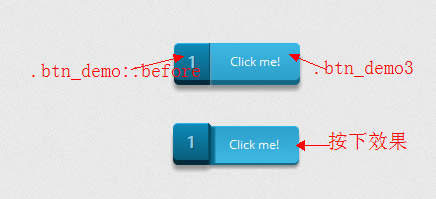
这里的样式属性没有什么特殊之处,只不过是一些CSS3的相关属性,这里唯一的亮点就是CSS3选择器的使用,上面使用了CSS3的属性选择器和伪类选择器。最终按钮效果:

4、CSS3制作Panel效果
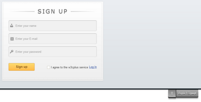
这个效果可以说是本次案例展示的一个亮点之一,通过CSS控制整个panel展开与收缩的效果,而且还要同时控制“loginBar”的位置与显示和隐藏(其中一个按钮是点击会展开panel而另一个按钮点击会折叠panel)。具体大家看下面的代码:
/*pannel面板效果*/
.loginBar {
	background: #ccc;
	margin: auto;
	height:0px;
	overflow: hidden;
	width: 100%;
	-moz-transition: all 0.125s linear 0s;
	-webkit-transition: all 0.125s linear 0s;
	-o-transition: all 0.125s linear 0s;
	-ms-transition: all 0.125s linear 0s;
	transition: all 0.125s linear 0s;
	box-shadow: 0px 0px 1px 0px rgba(0,0,0,0.8), 0 1px 2px 2px rgba(0, 0, 0, 0.2);
	border-bottom: 5px solid #1c252b;
	background-color: #d9dee2;
	background-image: -webkit-gradient(linear, left top, left bottom, from(#ebeef2), to(#d9dee2));
	background-image: -webkit-linear-gradient(top, #ebeef2, #d9dee2);
	background-image: -moz-linear-gradient(top, #ebeef2, #d9dee2);
	background-image: -ms-linear-gradient(top, #ebeef2, #d9dee2);
	background-image: -o-linear-gradient(top, #ebeef2, #d9dee2);
	background-image: linear-gradient(top, #ebeef2, #d9dee2);
}
/*不显示checkbox样式*/
#topBar {
	border: 0 none !important;
	clip: rect(1px,1px,1px,1px);
	height: 1px !important;
	overflow: hidden !important;
	position: absolute !important;
	width: 1px !important;
}
/*控制按钮位置*/
[for="topBar"] {
	-moz-transition: all 0.25s ease-out 0s;
	-webkit-transition: all 0.25s ease-out 0s;
	-o-transition: all 0.25s ease-out 0s;
	-ms-transition: all 0.25s ease-out 0s;
	transition: all 0.25s ease-out 0s;
	cursor: pointer;
	position: absolute;
	top: 11px;
	right: 10%;
	z-index: 999;
}

[for="topBar"] span {
	-moz-transition: all 0.125s linear 0s;
	-webkit-transition: all 0.125s linear 0s;
	-o-transition: all 0.125s linear 0s;
	-ms-transition: all 0.125s linear 0s;
	transition: all 0.125s linear 0s;
	color: #FFFFFF;
  font: 12px 'Kaushan Script',cursive;
  letter-spacing: 1px;
  text-shadow: 0 1px 0 rgba(0, 0, 0, 0.6), 0 2px 0 rgba(0, 0, 0, 0.6);
}

[for="topBar"] span:nth-of-type(1),
#topBar:checked ~ [for="topBar"] span:nth-of-type(2) {
  padding:8px 10px;
	border: none;
	border-left:solid 1px rgba(0, 0, 0, 08);
	background: -moz-linear-gradient(top, rgba(0, 0, 0, 0.3) 0%, rgba(0, 0, 0, 0.5) 100%); /* FF3.6+ */
	background: -webkit-gradient(linear, left top, left bottom, color-stop(0%,rgba(0, 0, 0, 0.3)), color-stop(100%,rgba(0, 0, 0, 0.5))); /* Chrome,Safari4+ */
	background: -webkit-linear-gradient(top, rgba(0, 0, 0, 0.3) 0%,rgba(0, 0, 0, 0.5) 100%); /* Chrome10+,Safari5.1+ */
	background: -o-linear-gradient(top, rgba(0, 0, 0, 0.3) 0%,rgba(0, 0, 0, 0.5) 100%); /* Opera 11.10+ */
	background: -ms-linear-gradient(top, rgba(0, 0, 0, 0.3) 0%,rgba(0, 0, 0, 0.5) 100%); /* IE10+ */
	background: linear-gradient(top, rgba(0, 0, 0, 0.3) 0%,rgba(0, 0, 0, 0.5) 100%); /* W3C */
	border-radius: 0 0 5px 0;
	box-shadow: 0 1px 0 rgba(0, 0, 0, 0.8) inset, 0 5px 0 0 rgba(0, 0, 0, 0.6), 0 10px 5px rgba(0, 0, 0, 0.3);
}
[for="topBar"] span:nth-of-type(1):active ,
#topBar:checked ~ [for="topBar"] span:nth-of-type(2):active{
	top:3px;
	border-left-color:rgba(0,0,0,0.33);
	background: -moz-linear-gradient(top, rgba(0, 0, 0, 0.13) 0%, rgba(0, 0, 0, 0.3) 100%); /* FF3.6+ */
	background: -webkit-gradient(linear, left top, left bottom, color-stop(0%,rgba(0, 0, 0, 0.13)), color-stop(100%,rgba(0, 0, 0, 0.3))); /* Chrome,Safari4+ */
	background: -webkit-linear-gradient(top, rgba(0, 0, 0, 0.13) 0%,rgba(0, 0, 0, 0.3) 100%); /* Chrome10+,Safari5.1+ */
	background: -o-linear-gradient(top, rgba(0, 0, 0, 0.13) 0%,rgba(0, 0, 0, 0.3) 100%); /* Opera 11.10+ */
	background: -ms-linear-gradient(top, rgba(0, 0, 0, 0.13) 0%,rgba(0, 0, 0, 0.3) 100%); /* IE10+ */
	background: linear-gradient(top, rgba(0, 0, 0, 0.13) 0%,rgba(0, 0, 0, 0.3) 100%); /* W3C */
	box-shadow: 0 1px 0 rgba(0,0,0,0.33) inset, 0 5px 0 0 rgba(0, 0, 0, 0.3), 0 10px 5px rgba(0, 0, 0, 0.23);
}

[for="topBar"] span:nth-of-type(1)::before,
#topBar:checked ~ [for="topBar"] span:nth-of-type(2)::before {
	background-color:rgba(0, 0, 0, 0.3);
	content:"⇓";
	width:35px;
	position:absolute;
	display:block;
	padding-top:8px;
	padding-bottom:6px;
	top:-7px;
	left:-36px;
	border-right:1px solid rgba(0, 0, 0, 0.3);
	background: -moz-linear-gradient(top, rgba(0, 0, 0, 0.5) 0%, rgba(0, 0, 0, 0.3) 100%); /* FF3.6+ */
	background: -webkit-gradient(linear, left top, left bottom, color-stop(0%,rgba(0, 0, 0, 0.5)), color-stop(100%,rgba(0, 0, 0, 0.3))); /* Chrome,Safari4+ */
	background: -webkit-linear-gradient(top, rgba(0, 0, 0, 0.5) 0%,rgba(0, 0, 0, 0.3) 100%); /* Chrome10+,Safari5.1+ */
	background: -o-linear-gradient(top, rgba(0, 0, 0, 0.5) 0%,rgba(0, 0, 0, 0.3) 100%); /* Opera 11.10+ */
	background: -ms-linear-gradient(top, rgba(0, 0, 0, 0.5) 0%,rgba(0, 0, 0, 0.3) 100%); /* IE10+ */
	background: linear-gradient(top, rgba(0, 0, 0, 0.5) 0%,rgba(0, 0, 0, 0.3) 100%); /* W3C */
	border-radius: 0 0 0 5px;
	box-shadow:0 1px 0 rgba(0, 0, 0, 0.9) inset, 0 5px 0 0 rgba(0, 0, 0, 0.7), 0 10px 5px rgba(0, 0, 0, 0.3);
	text-align: center;
	color: #FFFFFF;
  font:20px/19px 'Kaushan Script',cursive
}
#topBar:checked ~ [for="topBar"] span:nth-of-type(2)::before {
	content:"⇑";
	top: -1px;
	padding-bottom: 9px;
}
[for="topBar"] span:nth-of-type(1):active::before,
#topBar:checked ~ [for="topBar"] span:nth-of-type(2):active::before {
	box-shadow:inset 0px 1px 0px rgba(0,0,0,0.8), 0px 5px 0px 0px rgba(0,0,0,0.3), 1px 1px 0px 0px rgba(0,0,0,0.25), 2px 2px 0px 0px rgba(0,0,0,0.25), 2px 5px 0px 0px rgba(0,0,0,0.25), 6px 4px 2px rgba(0,0,0,0.25), 0px 10px 5px rgba(0,0,0,0.15) ;
}

/*pannel折叠时隐藏按钮二*/
[for="topBar"] span:nth-of-type(2) {
  display: none;
  visibility: hidden;
}
/*改变按钮悬停文字颜色*/
[for="topBar"] span:hover,
[for="topBar"] span:hover::before {
  color: #35CFD9;
}
/*
*点击label后,input[type="checkbox"]处于选择状态:checked
*使用通用兄弟选择器(E~F)控制panel展开
*/
#topBar:checked ~ .loginBar {
  height: auto;
}
/*
*点击label后,input[type="checkbox"]处于选择状态:checked
*使用通用兄弟选择器(E~F)改变按钮的位置
*/
#topBar:checked ~ [for="topBar"] {
  opacity: 1;
	top: 426px;
}
/*checkbox选中时,按钮一隐藏*/
#topBar:checked ~ [for="topBar"] span:nth-of-type(1) {
  display: none;
  visibility: hidden;
}
/*checkbox选中时,按钮二显示*/
#topBar:checked ~ [for="topBar"] span:nth-of-type(2) {
  display: block;
  visibility: visible;
}
/*checkbox选中时,改变按钮的悬停状态文本色*/
#topBar:checked ~ [for="topBar"] span:hover,
#topBar:checked ~ [for="topBar"] span:hover::before {
  color: #35CFD9;
}
这一部分可能复杂一些,因为大家并不常使用,而且还需要控制好怎么显示,如何显示。具体效果呆会大家可以下载DEMO看实际效果,这样或许更好理解。
那么到这里有关于样式的部分就全部完成了,大家可以仔细看看代码。需要有耐性哟(^…^)!
jQuery Code
全例中还使用了两个jQuery效果,一个呢是前面介绍过的翻转表单;另一个就是BootStrap中的Tooltip效果
1、jQuery写的翻转代码
		$(function(){
	//checking for css 3d transformation support
	$.support.css3d = supportsCSS3D();
	var formContainer = $("#formContainer");
	//Listening for clicks on the ribbon links
	$(".flipLink").click(function(e){
		//flipping the forms
		formContainer.toggleClass("flipped");
		//if there is no css3 3d support, simply hide the login form (exposing the recover one)
		if(!$.support.css3d){
			$("#login").toggle();
		}
		e.preventDefault();
	});

	formContainer.find("form").submit(function(e){
		//Preventing form submissions.if you implement a backedn,you will want to remove this code
			e.preventDefault();
		});

	//a helper function that checks for the support of the 3d css3 transformations
	function supportsCSS3D(){
		var props = ["perspectiveProperty","WebkitPerspective","MozPerspective"],testDom = document.createElement("a");
		for(var i = 0; i < props.length; i++){
			if(props[i] in testDom.style){
				return true;
			}
		}
		return false;
	}
});
2、Tooltip代码
大家可以下载到这里下载bootstrap的tooltip的插件,然后在页面中调用:
	$(function(){
		$('#formContainer').tooltip({
			selector: "a[rel=tooltip]"
		})
	});
这样tip效果就出来了。
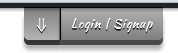
花了老长的篇幅,到这里总算是完工了,你要是没有出错的话,我想你在你的本地就能看到下面这样的一效果了。
载入页面时效果:
面板展开时效果:
触发表单旋转处
大家感兴趣的话可以下载demo查看。
今天就说到这里了,最后希望大家喜欢这个效果,最好使用现代浏览器查看,IE下没有进行任何的测试。如果你有更好的想法,欢迎在下面的评论中留言。
如需转载烦请注明出处:W3CPLUS


