

CSS3制作图片样式
作者:大漠 日期:2011-10-07 点击:561

在《jQuery和CSS3给图片制作圆角》一文中说过了,当你在Web页面制作中如果你直接把CSS3中的border-radius和box-shadow应用在图片,浏览器并不会完全显示。前面在《jQuery和CSS3给图片制作圆角》中说过其解决方法,就是把图片作为背景图片,这样我们就可以应用任何样式来修饰图片,而且此时浏览器也会完美的呈现出来。Darcy Clarke和Web Designer Wall都有介绍如何使用jQuery方法动态将图片转换成背景图片来解决。今天我要给大家呈现的是由Web Designer Wall介绍的《CSS3 Image Styles 》,Web Designer Wall在里面告诉我们如何使用CSS3的border-radius和box-shadow给图片制作多种不同风格的样式。
问题
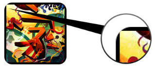
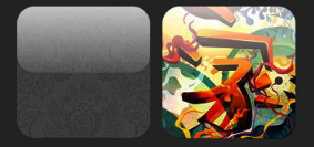
这里重新提一回,如果在img上直接使用CSS3的border-radius和box-shadow应用在图片,浏览器并不会完全显示。前面在《jQuery和CSS3给图片制作圆角》中说过其解决方法,就是把图片作为背景图片,这样我们就可以应用任何样式来修饰图片,而且此时浏览器也会完美的呈现出来。Darcy Clarke和Web Designer Wall都有介绍如何使用jQuery方法动态将图片转换成背景图片来解决。今天我要给大家呈现的是由Web Designer Wall介绍的《CSS3 Image Styles 》,Web Designer Wall在里面告诉我们如何使用CSS3的border-radius和box-shadow的inset时,在部分浏览器上将无法正常呈现。你也可以使用Safari或Firefox(4.0版本以下)打开Demo查看“正常图像”一栏,图像不能正常渲染圆角和内阴影效果。
解决方法
要让浏览器能正常渲染图像的圆角和内阴影效果,你需要将图像转为背景图像来渲染。
<div style="background:url(image.jpg)" no-repeat center center;width:150px;height:150px></div>
jQuery动态解决方法
上面的方法是直接将图像用背景图像来渲染。为了使它能动态的解决,你可以使用jQuery方法动态的将每个图像转为另一个元素的背景图片。下面的代码是使用jQuery方法将图像在外面包裹一个<span>标签,并把图像转为其背景图片(具体的解决方法,你可以参考《jQuery和CSS3给图片制作圆角》一文)。
		<script type="text/javascript" src="http://ajax.googleapis.com/ajax/libs/jquery/1.5/jquery.min.js"></script>
		<script type="text/javascript">
			$(document).ready(function(){
				$("img").load(function() {
					$(this).wrap(function(){
						return '<span class="image-wrap ' + $(this).attr('class') + '" style="position:relative; display:inline-block; background:url(' + $(this).attr('src') + ') no-repeat center center; width: ' + $(this).width() + 'px; height: ' + $(this).height() + 'px;" />';
					});
					$(this).css("opacity","0");
				});
			});
输出
上面的jQuery代码将输出下面的HTML代码
		<span class="image-wrap " style="position:relative; display:inline-block; background:url(image.jpg) no-repeat center center; width: 150px; height: 150px;">
			<img src="image.jpg" style="opacity: 0;" alt="" />
		</span>
有了上面的方法,我们就可以在图片上使用任何CSS3的属性,来制作不同的效果,下面我们就一起来看Web Designer Wall给我们带来的多种CSS3修饰图像的效果制作方法
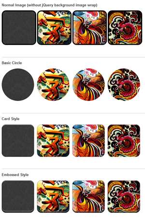
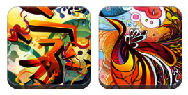
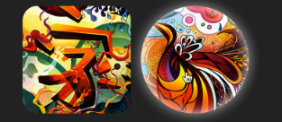
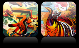
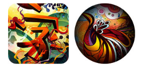
一、圆图像效果(Circle Image):
这种效果主要在图像上使用CSS3的border-radius属性,制作一张圆形图像。
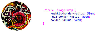
CSS Code
		.circle .image-wrap {
			-webkit-border-radius: 50em;
			-moz-border-radius: 50em;
			border-radius: 50em;
		}
使用CSS3的border-radius制作圆角只要注意一点,将其值设置为元素宽度和高度的一半,并且元素的宽度和高度是相同的,具体制作方法大家可以参考Cardeo给我们提供的《How To Create Circles With CSS3 and No Images》,里面详细介绍了使用border-radius制作圆的方法。
二、卡片风格(Card Style ):
下面是一个卡片的影像风格,使用了CSS3的border-radius和多个box-shadow的inset效果叠加而成。
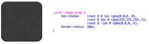
CSS Code
		.card .image-wrap {
			-webkit-box-shadow: inset 0 0 1px rgba(0,0,0,.8), inset 0 2px 0 rgba(255,255,255,.5), inset 0 -1px 0 rgba(0,0,0,.4);
			-moz-box-shadow: inset 0 0 1px rgba(0,0,0,.8), inset 0 2px 0 rgba(255,255,255,.5), inset 0 -1px 0 rgba(0,0,0,.4);
			box-shadow: inset 0 0 1px rgba(0,0,0,.8), inset 0 2px 0 rgba(255,255,255,.5), inset 0 -1px 0 rgba(0,0,0,.4);
			-webkit-border-radius: 20px;
			-moz-border-radius: 20px;
			border-radius: 20px;
		}
三、浮雕样式(Embossed Style):
在效果二的基础上将内阴影稍加修改,就得到下面的浮雕效果
CSS Code
		.embossed .image-wrap {
			-webkit-box-shadow: inset 0 0 2px rgba(0,0,0,.8), inset 0 2px 0 rgba(255,255,255,.5), inset 0 -7px 0 rgba(0,0,0,.6), inset 0 -9px 0 rgba(255,255,255,.3);
			-moz-box-shadow: inset 0 0 2px rgba(0,0,0,.8), inset 0 2px 0 rgba(255,255,255,.5), inset 0 -7px 0 rgba(0,0,0,.6), inset 0 -9px 0 rgba(255,255,255,.3);
			box-shadow: inset 0 0 2px rgba(0,0,0,.8), inset 0 2px 0 rgba(255,255,255,.5), inset 0 -7px 0 rgba(0,0,0,.6), inset 0 -9px 0 rgba(255,255,255,.3);
			-webkit-border-radius: 20px;
			-moz-border-radius: 20px;
			border-radius: 20px;
		}
四、软浮雕效果(Soft Embossed ):
这也是一种浮雕效果,只是这个效果增加了一点模糊效果
CSS Code
		.soft-embossed .image-wrap {
			-webkit-box-shadow: inset 0 0 4px rgba(0,0,0,1), inset 0 2px 1px rgba(255,255,255,.5), inset 0 -9px 2px rgba(0,0,0,.6), inset 0 -12px 2px rgba(255,255,255,.3);
			-moz-box-shadow: inset 0 0 4px rgba(0,0,0,1), inset 0 2px 1px rgba(255,255,255,.5), inset 0 -9px 2px rgba(0,0,0,.6), inset 0 -12px 2px rgba(255,255,255,.3);
			box-shadow: inset 0 0 4px rgba(0,0,0,1), inset 0 2px 1px rgba(255,255,255,.5), inset 0 -9px 2px rgba(0,0,0,.6), inset 0 -12px 2px rgba(255,255,255,.3);
			-webkit-border-radius: 20px;
			-moz-border-radius: 20px;
			border-radius: 20px;
		}
五、剪影效果(Cutout Style ):
同样是box-shadow的inset的值变化,但此例看上去像一种剪影效果
CSS Code
		.cut-out .image-wrap {
			-webkit-box-shadow: 0 1px 0 rgba(255,255,255,.2), inset 0 4px 5px rgba(0,0,0,.6), inset 0 1px 0 rgba(0,0,0,.6);
			-moz-box-shadow: 0 1px 0 rgba(255,255,255,.2), inset 0 4px 5px rgba(0,0,0,.6), inset 0 1px 0 rgba(0,0,0,.6);
			box-shadow: 0 1px 0 rgba(255,255,255,.2), inset 0 4px 5px rgba(0,0,0,.6), inset 0 1px 0 rgba(0,0,0,.6);
			-webkit-border-radius: 20px;
			-moz-border-radius: 20px;
			border-radius: 20px;
		}
六、变形和发光效果(Morphing & Glowing):
在这个效果中,增加了CSS3的transition效果,当你的鼠标悬停在图片上时,图片会从一个圆角图片转圆形图片,并会发光。使用多重box-shadow来模仿发光效果。
CSS Code
		.morphing-glowing .image-wrap {
			-webkit-transition: 1s;
			-moz-transition: 1s;
			transition: 1s;
			-webkit-border-radius: 20px;
			-moz-border-radius: 20px;
			border-radius: 20px;
		}

		.morphing-glowing .image-wrap:hover {
			-webkit-box-shadow: 0 0 20px rgba(255,255,255,.6), inset 0 0 20px rgba(255,255,255,1);
			-moz-box-shadow: 0 0 20px rgba(255,255,255,.6), inset 0 0 20px rgba(255,255,255,1);
			box-shadow: 0 0 20px rgba(255,255,255,.6), inset 0 0 20px rgba(255,255,255,1);
			-webkit-border-radius: 60em;
			-moz-border-radius: 60em;
			border-radius: 60em;
		}
七、图片渐变效果(Glossy Overlay ):
这个效果,在元素的伪类上增加了一个渐变的效果。
CSS Code
		.glossy .image-wrap {
			-webkit-box-shadow: inset 0 -1px 0 rgba(0,0,0,.5);
			-moz-box-shadow: inset 0 -1px 0 rgba(0,0,0,.5);
			box-shadow: inset 0 -1px 0 rgba(0,0,0,.5);
			-webkit-border-radius: 20px;
			-moz-border-radius: 20px;
			border-radius: 20px;
		}
		.glossy .image-wrap:after {
			position: absolute;
			content: ' ';
			width: 100%;
			height: 50%;
			top: 0;
			left: 0;
			-webkit-border-radius: 20px;
			-moz-border-radius: 20px;
			border-radius: 20px;
			background: -moz-linear-gradient(top, rgba(255,255,255,0.7) 0%, rgba(255,255,255,.1) 100%);
			background: -webkit-gradient(linear, left top, left bottom, color-stop(0%,rgba(255,255,255,0.7)), color-stop(100%,rgba(255,255,255,.1)));
			background: -webkit-linear-gradient(top, rgba(255,255,255,0.7) 0%,rgba(255,255,255,.1) 100%);
			background: -o-linear-gradient(top, rgba(255,255,255,0.7) 0%,rgba(255,255,255,.1) 100%);
		}
八、倒影效果(Reflection ):
使用伪类制作了一个倒影效果,并应用hover改变其位置。

CSS Code
		.reflection .image-wrap {
			-webkit-box-shadow: inset 0 0 1px rgba(0,0,0,.5), inset 0 2px 0 rgba(255,255,255,.5), inset 0 -1px 0 rgba(0,0,0,.5);
			-moz-box-shadow: inset 0 0 1px rgba(0,0,0,.5), inset 0 2px 0 rgba(255,255,255,.5), inset 0 -1px 0 rgba(0,0,0,.5);
			box-shadow: inset 0 0 1px rgba(0,0,0,.5), inset 0 2px 0 rgba(255,255,255,.5), inset 0 -1px 0 rgba(0,0,0,.5);
			-webkit-transition: .5s;
			-moz-transition: .5s;
			transition: .5s;
			-webkit-border-radius: 20px;
			-moz-border-radius: 20px;
			border-radius: 20px;
			}
			.reflection .image-wrap:after {
			position: absolute;
			content: ' ';
			width: 100%;
			height: 30px;
			bottom: -31px;
			left: 0;
			-webkit-border-top-left-radius: 20px;
			-webkit-border-top-right-radius: 20px;
			-moz-border-radius-topleft: 20px;
			-moz-border-radius-topright: 20px;
			border-top-left-radius: 20px;
			border-top-right-radius: 20px;
			background: -moz-linear-gradient(top, rgba(0,0,0,.3) 0%, rgba(255,255,255,0) 100%);
			background: -webkit-gradient(linear, left top, left bottom, color-stop(0%,rgba(0,0,0,.3)), color-stop(100%,rgba(255,255,255,0)));
			background: linear-gradient(top, rgba(0,0,0,.3) 0%,rgba(255,255,255,0) 100%);
			}
			.reflection .image-wrap:hover {
			position: relative;
			top: -8px;
			}
九、发光和倒影效果(Glossy & Reflection ):
这个效果使用了伪类创建了一个渐变加倒影图像的效果。
CSS Code
		.glossy-reflection {
			background: #000;
			padding: 20px 40px 50px;
			color: #fff;
			-webkit-border-radius: 20px;
			-moz-border-radius: 20px;
			border-radius: 20px;
			}
			.glossy-reflection .image-wrap {
			-webkit-box-shadow: inset 0 -1px 0 rgba(0,0,0,.5), inset 0 1px 0 rgba(255,255,255,.6);
			-moz-box-shadow: inset 0 -1px 0 rgba(0,0,0,.5), inset 0 1px 0 rgba(255,255,255,.6);
			box-shadow: inset 0 -1px 0 rgba(0,0,0,.5), inset 0 1px 0 rgba(255,255,255,.6);
			-webkit-transition: 1s;
			-moz-transition: 1s;
			transition: 1s;
			-webkit-border-radius: 20px;
			-moz-border-radius: 20px;
			border-radius: 20px;
			}
			.glossy-reflection .image-wrap:before {
			position: absolute;
			content: ' ';
			width: 100%;
			height: 50%;
			top: 0;
			left: 0;
			-webkit-border-radius: 20px;
			-moz-border-radius: 20px;
			border-radius: 20px;
			background: -moz-linear-gradient(top, rgba(255,255,255,0.7) 0%, rgba(255,255,255,.1) 100%);
			background: -webkit-gradient(linear, left top, left bottom, color-stop(0%,rgba(255,255,255,0.7)), color-stop(100%,rgba(255,255,255,.1)));
			background: linear-gradient(top, rgba(255,255,255,0.7) 0%,rgba(255,255,255,.1) 100%);
			}
			.glossy-reflection .image-wrap:after {
			position: absolute;
			content: ' ';
			width: 100%;
			height: 30px;
			bottom: -31px;
			left: 0;
			-webkit-border-top-left-radius: 20px;
			-webkit-border-top-right-radius: 20px;
			-moz-border-radius-topleft: 20px;
			-moz-border-radius-topright: 20px;
			border-top-left-radius: 20px;
			border-top-right-radius: 20px;
			background: -moz-linear-gradient(top, rgba(230,230,230,.3) 0%, rgba(230,230,230,0) 100%);
			background: -webkit-gradient(linear, left top, left bottom, color-stop(0%,rgba(230,230,230,.3)), color-stop(100%,rgba(230,230,230,0)));
			background: linear-gradient(top, rgba(230,230,230,.3) 0%,rgba(230,230,230,0) 100%);
			}
十、胶带效果(Tape Style ):
这个效果中使用了伪类和渐变制作了一种胶带效果。
CSS Code
		.tape .image-wrap {
			-webkit-box-shadow: inset 0 0 2px rgba(0,0,0,.7), inset 0 2px 0 rgba(255,255,255,.3), inset 0 -1px 0 rgba(0,0,0,.5), 0 1px 3px rgba(0,0,0,.4);
			-moz-box-shadow: inset 0 0 2px rgba(0,0,0,.7), inset 0 2px 0 rgba(255,255,255,.3), inset 0 -1px 0 rgba(0,0,0,.5), 0 1px 3px rgba(0,0,0,.4);
			box-shadow: inset 0 0 2px rgba(0,0,0,.7), inset 0 2px 0 rgba(255,255,255,.3), inset 0 -1px 0 rgba(0,0,0,.5), 0 1px 3px rgba(0,0,0,.4);
			}
			.tape .image-wrap:after {
			position: absolute;
			content: ' ';
			width: 60px;
			height: 25px;
			top: -10px;
			left: 50%;
			margin-left: -30px;
			border: solid 1px rgba(137,130,48,.2);
			background: -moz-linear-gradient(top, rgba(254,243,127,.6) 0%, rgba(240,224,54,.6) 100%);
			background: -webkit-gradient(linear, left top, left bottom, color-stop(0%,rgba(254,243,127,.6)), color-stop(100%,rgba(240,224,54,.6)));
			background: linear-gradient(top, rgba(254,243,127,.6) 0%,rgba(240,224,54,.6) 100%);
			-webkit-box-shadow: inset 0 1px 0 rgba(255,255,255,.3), 0 1px 0 rgba(0,0,0,.2);
			}
十一、变形和着色效果(Morphing & Tinting)
这个效果使用了径向渐变和transition,以及伪类制作一种变形和着色效果,当鼠标悬停在图片上时,图片会变成圆形,并着上另一种颜色。
CSS Code
		.morphing-tinting .image-wrap {
			position: relative;
			-webkit-transition: 1s;
			-moz-transition: 1s;
			transition: 1s;
			-webkit-border-radius: 20px;
			-moz-border-radius: 20px;
			border-radius: 20px;
			}
			.morphing-tinting .image-wrap:hover {
			-webkit-border-radius: 30em;
			-moz-border-radius: 30em;
			border-radius: 30em;
			}
			.morphing-tinting .image-wrap:after {
			position: absolute;
			content: ' ';
			width: 100%;
			height: 100%;
			top: 0;
			left: 0;
			-webkit-transition: 1s;
			-moz-transition: 1s;
			transition: 1s;
			-webkit-border-radius: 30em;
			-moz-border-radius: 30em;
			border-radius: 30em;
			}
			.morphing-tinting .image-wrap:hover:after {
			background: -webkit-gradient(radial, 50% 50%, 40, 50% 50%, 80, from(rgba(0,0,0,0)), to(rgba(0,0,0,1)));
			background: -moz-radial-gradient(50% 50%, circle, rgba(0,0,0,0) 40px, rgba(0,0,0,1) 80px);
			}
十二、羽化效果(Feather Edge Circle ):
最后一个效果使用了渐变制作的羽化效果。
CSS Code
		.feather .image-wrap {
			position: relative;
			-webkit-border-radius: 30em;
			-moz-border-radius: 30em;
			border-radius: 30em;
			}
			.feather .image-wrap:after {
			position: absolute;
			content: ' ';
			width: 100%;
			height: 100%;
			top: 0;
			left: 0;
			background: -webkit-gradient(radial, 50% 50%, 50, 50% 50%, 70, from(rgba(255,255,255,0)), to(rgba(255,255,255,1)));
			background: -moz-radial-gradient(50% 50%, circle, rgba(255,255,255,0) 50px, rgba(255,255,255,1) 70px);
			}
浏览器兼容
我们在此讨论的是CSS3的图片样式,所以这种技术制作的图片效果只有在现代浏览器上运行。所以在IE6-8下是只能显示图片,不会有上述的效果。如果你还在使用那些古老的浏览器,我强烈建议你安装Mozilla Firefox、Google Chrome、Safari、Opera,你将会看到很好的效果。
上面就是Web Designer Wall在《CSS3 Image Styles 》一文中给我们带来的十二种使用CSS3的border-radius、box-shadow、rgba、transition、gradient以及伪类“:before”和“:after”等属性制作的图片效果。大家也可以发挥你的想像力和创建力制作出更佳和更炫的效果。如果你有更好的效果,请在评论中分享。
如果大家对上面的效果感兴趣可以自己动手亲自体验一下,也可以直接从Demo中查看源码。最后再次感谢Web Designer Wall给我们带来这么好的教程——《CSS3 Image Styles 》。
如需转载烦请注明出处:W3CPLUS


